


It’s one of those applications that you’ll always find in your dock on OS X; Preview. What does it do? Well, it gives you a way to check out a series of images and do lightweight modifications like cropping and rotating, all for low ‘cost’ (system resources). Needless to say, if it’s an app that will be around a lot, you’ll see it’s icon a lot. In Quicksilver, I see it all the time. It’s always in my dock; I thought, if you can’t live without it, then at least give it a place in your dock instead of always having it inactive on the right. Anyway, I got extremely annoyed with it’s default icon of a happy child on the beach with a sort of eyeglass. The application Mimiphoto makes it easy to put your own image below the eyeglass, so I took Magritte’s ‘Ceci N’est Pas une Pipe’, kind of turning it into a self-referencing ‘Ceci n’est pas un Preview’.
However, I didn’t like it still. First of all, it’s not clean at all, I disliked it in 32 pixels and below (icon sizes that require special care and pixel-pushing for clear images) and well, I started looking for replacements. I swear, once you’ve seen one, you’ve seen them all. I don’t like that damn loupe, eyeglass, whatever you want to call it. It’s stupid. So I made a new metaphor for previewing. Here you go, free for personal use. It’s got it’s own small webpage, a DMG download, and very clear terms stating no commercial use and attribution. If you want to be an ass and use it on your website or whatever anyway, I’ll just take the icon down. I’m that much of an asshole. Of course, you’ll also be in legal trouble.
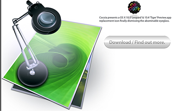
But I trust my loyal readers to just enjoy this, adhere to my terms, and respect the extreme amount of time that went into it (this lamp doesn’t exist, I just made it up along the way) and provide feedback. I hope you enjoy it as much as I did making it and having it done now.
The icon looks nice. I didn’t realize how much the Preview icon bothered me until I replaced it. Thanks for making this more modern looking icon.
Very nice, mate!
Which I already told you, but now for the record. ;)
Another great piece from Cocoia.
I didn’t have time to install the icon yesterday night, but I can’t wait to install it.
Max is right, I’m also annoyed by the current preview icon, but I never got the chance to find a replacement ….
Thanks a bundle,
Ritchie
Oh yeah, this is really beautiful. Preview is now one of the three most beautiful apps in /Applications. I love your use of “Leaf Curl.jpg”. The green now makes it stand out in the Dock, much like Textmate does with purple.
I really hope that you get work from other OS X developers; as you’ve been saying, there are a large number of great apps with terrible icons. I was pretty surprised that the Little Snitch developers were mildly offended during your interview. Perhaps this icon can convince them to hire you.
It was a surprise to me that just changing the icon of Preview also changed my perspective of the program… for the better. Great icon!
Lovely work! I too, find the Preview default icon extremely ugly.
May I suggest you tackle the terrible Stickies icon at some point?
could you please make the leopard version available, or will the tiger one work in leopard? thanks, please email me.
:: drooling ::
will you post the high-res leopard version, or tell me how to obtain it? i couldn’t agree more with your terms, but i also can’t find the download link…
where can i find the leopard version of this icon? i have been searching for hours… please let me know how to obtain it!
(sorry for the double post — i checked back later and my previous post was not visible, for reasons unknown)