


06
Jan
UI Spotlight: Picasa for Mac
Category: Interface Design, Personal
Before you associate the following UI design with me or Cocoia, let me assure you that I have had no involvement in Picasa whatsoever. With that out of the way, the recently released Picasa Mac version is quite… unique when it comes to UI.
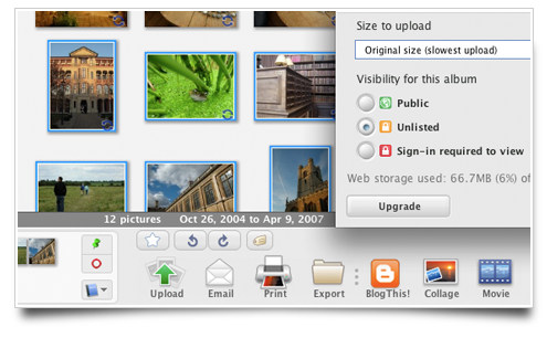
This image illustrates nicely how Picasa seems to use mixed sans and serif typography, wholly custom controls and strange, nonstandard color palettes throughout the app. I must admit I’d expected more from Google; I’ll stick with iPhoto for now.
Update: Michael J. Tsai reports that Google is using a cross-platform toolkit, which also prohibits Picasa from running on PowerPC Macs. Weak.
Google doesn’t really have a strong track record of “beautiful” UI design, so while this isn’t entirely surprising, it does strike me as odd that some of this non-standard stuff seems to be purposefully done so. Definitely strange…
Google needs some proper UI designers ..
The Picasa interface is unusual on any platform, but I don’t think it’s ineffective. It seems to me from a bit of usage that they’ve successfully avoided the “uncanny valley” problem, and it’s just a heavily custom UI.
My photos will stay in Aperture, but I find Picasa’s looser organization works well for me with artwork, screenshots and wallpapers; I’ve been handling those types of images with Picasa/Win until now, and it will be nice to move it to Mac.
Michael Lake is right… Google’s UI usually looks bad. I’m not surprised. They should stick to clean interfaces like google.com, or hire some more qualified designers – ‘coz they DO build great apps.
Yet it’s better than iPhoto and perfect for recent (or future) PC converts!
Here’s Mac users dirty little secret: They don’t like “unique” user interfaces.
@Jorge Pedroso
Of course they don’t! They like the UI that’s been designed by Apple. Apple privides de UI for controls and panels and all that stuff. People like consistency, that was one of the whole points of Leopard in the first place.
Remember the good-bye to the brushed metal look? Consistency. That’s what most people want.
@Leonardo
That’s right! Consistency and usability are like brothers!
Mind you, I’m still an iPhoto user myself. However, there are quite a few people that used Picasa on Windows and have since switched to Mac and want Picasa for the Mac. Those folks are going to love this Mac version.
I do have to say that if you are not going to use or even look at Picasa just because they don’t use a consistent font, then I have to say that you seem a little superficial.
I downloaded it and took a look at it. It’s loyal to it’s Windows counterpart. It’s snappy and doesn’t require you to “import/export” images anywhere. There are quite a few people, including myself, that don’t put every photo I acquire into iPhoto. Picasa is a great tool for “lightboxing” those images.
As a side note. I am a 2 and a half year Mac user and not only do I “not mind” unique user interfaces. I find unique interfaces all over the place in Mac software. I could name hundreds of programs that have unique UI’s that I use. Fantasktik, iStat, Find Any File are just a few.
ugh… horrible.
@Dave: I’m sure the ideas behind Picasa are sound. It’s still governed by a (well?) funded team, with an interaction designer and no doubt some testers. The problem is that they failed to take into account any of the UI conventions on the Mac platform. My main problem with it is not the typography; it’s the complete disregard for making anything look or work even remotely like their Mac counterparts.
Take the left source list, for instance. I cannot think of a valid reason why this isn’t a standard OS X-style source list, apart from them using some half-assed cross-platform UI toolkit that makes it hard on them to make such a source list. It uses custom, strange-looking scroll bars. Funny buttons. Curious sliders. I could go on, but what I’m trying to say here is that the main problem is them actually using such a toolkit to create a whole UI that simply doesn’t fit into the Mac aesthetic, and does not adhere to virtually all guidelines set forth in Apple’s great, well-written HIG.
Google is a multi-billion dollar enterprise. I’d have expected better from a new tech startup.
Especially Windows converts (like my dad) will LOVE this Picasa for Mac! It’s the same interface he has been using for months now on his XP.
And the interface isn’t THAT bad. And the app is much faster than iPhoto!
@sebastiaan: I can give you a pretty good reason for their not using OS X specific UI guidelines. This is not a Mac only product. Why should the Windows and Linux versions look like a program running on a Mac?
Now that Apple has announced iLife ’09, it’s clear that Picasa is a *great* alternative to spending $80 just to get a program to store photos in. Oh sure, Apple added a few nice features like Faces. However, I suspect that Google isn’t far behind in doing the same. They already have a working face recognition system. It’s not as “great” as what Apple is showing in iPhoto, but its a start.
I looked at all the programs and features in the new iLife ’09 and have decided that since the only program I used to use in that package was iPhoto, I’ll be passing on upgrading to the new version and probably switching to Picasa since Picasa is free and iPhoto is $80. A no-brainer really.
Look, I have no problem with strong and consistent UI. As a developer, I strive to make everything I work on as easy to use as Mac software is. However, when it comes to working on cross-platform projects, I look for a nice middle that allows all users to enjoy the product instead of just a handful.
Picasa has had it’s current UI for quite some time and I don’t see why they should change it to please a few people who look for UI perfection.
@Dave M.
Picasa should be following the Mac OS X human interface guidelines because it’s running on Mac OS X. On Windows, Picasa should be following the Windows guidelines — believe it or not, such things do exist. (On Linux all bets are off, but that’s par for the course with Linux.)
This is Cross Platform Development 101 – look and feel like the target platform.
Users want all of the software they’re using to look and work in similar fashion. One of the reasons Flash causes such usability problems on the Web is that every Flash use has its own slightly different scroll bar; this is the same situation.
Cluttered. Inconsistent. Ugly.
Putting aside the fact that they avoided the use of native controls (a huge no-no), they couldn’t even manage to put a clean design together with their own custom toolkit.
It’s interesting that everyone ignores the advantage this interface (and the mere program itself) has for Windows converts or for attracting Windows users to the Mac …
I don’t think people are missing the idea that a common interface makes converting from another version of Picasa easier, as that fact has been pointed out several times already. However, what I do think people are missing is what is lossed by using a non-native interface.
An application’s interface has the purpose of making the application’s features accessible to its users. For a Mac version of Picasa, those users are assumed to be Mac users. You read that right: the main target for a Mac application is not Windows users (or converts… whom I guess are like tourists?)
Read Apple’s Human Interface Guidelines if you want an exhaustive list of reasons why an application should not sport an interface that looks or behaves significantly different from its native OS. For those who haven’t read it (I’m looking at you google), it should suffice to say the main reason against non-native controls is that they increase the amount of time it takes to learn how to use or even discover an application’s features.
A special addendum for OS “converts” is that an application that uses a non-native interface may mislead said “converts” into believing that their new OS behaves like their previous OS. This could stifle a user’s willingness to learn the conventions of their new OS and lead to frustration when lack of that knowledge unnecessarily impedes their work flow.
Wow, that is one of the ugliest interfaces I have seen in a while!
On consistency: Screw consistency! Actually Apple isn’t too consistent with their apps. iPhoto uses light blues for ‘selected’ states on buttons, other apps have different conventions. Look at the difference between GarageBand, iPhoto, Aperture, Final Cut Pro!
The issue at hand is not so much that Picasa is inconsistent. It’s downright ugly.
@Jerome
In general, “the apps on Y look and work just like the apps on X” isn’t an attractive argument to anyone but an accounting department. People who have a choice are presumably using the Mac (or Windows, or Linux) because they feel it is better, more productive, more usable than the other platforms. The native human interface and platform capabilities are what do that.
A Windows user who switches to the Mac is going to have to learn how Mac applications look and feel and their standard user interface conventions anyway. Having some applications on their system that look and work the same as those on Windows — and differently from the rest on the Mac — can actually be disruptive to that learning experience.
Ok, I get that … but everything has advantages and disadvantages.
But maybe I’m just weird, I also prefer Lightroom’s interface to Aperture’s ;)