


I was contacted by Acqualia – the creators of the Apple Design Award-winning application Picturesque – to design a new icon. Picturesque, an application I already use on my blog, is stunningly simple in its purpose and product; it beautifies images, but not in the typical Core Image-filter like fashion you see most of the time. The true power is the simplicity; there’s no ugly distorting filters to get in your way, but a few tools catered to your needs which provide instant satisfaction.
Read on for the inside process in this ‘Making the Icon’ post.
![]() The initial icon for Picturesque, by Tom Stoelwinder, offered a simple metaphor for the purpose and workings of the application; a magic wand conjured a beautiful frame around the image in a stroke. I asked Tom about the icon;
The initial icon for Picturesque, by Tom Stoelwinder, offered a simple metaphor for the purpose and workings of the application; a magic wand conjured a beautiful frame around the image in a stroke. I asked Tom about the icon;
“I remember Zac (one of the Picturesque developers – red) wanted a front-on picture frame, pretty much completely rectangular with no perspective. He wanted it floating off the ground, with a ground shadow far beneath it, at the bottom of the canvas. (…) I managed to convince him that it’d be a better idea to go for a perspective-ized frame and wand – I guess that’s all to say really – like I said, was great to work on.”
Although it certainly wasn’t a bad icon by any definition (in fact, I think it’s a very pretty icon), we decided it would be nicer if the icon clearly communicated the simplicity and purpose of the application.
We started exploring metaphors for the icon. We initially enjoyed the ‘magic’ metaphor, but we really craved for something fundamentally more related to the application. There were a lot of applications out there using magic wands or other magician’s accessories. Additionally, with Eugen Buzuk‘s excellently designed Image Tricks icon, it’s hard to even compete without ending up confused user.
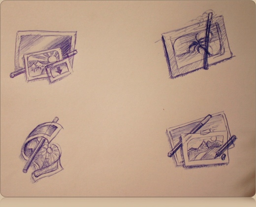
A few sketches from the first phase of exploring metaphors.
A new perspective on the metaphor was chosen, relating more directly to beauty, beautification and bringing out the best in images. I experimented with an interesting metaphor; a makeup table, also consistent with the base shape of Picturesque’s ‘drop zone’ window that the application presents at startup. I lost the original sketch for this, so here are a few rough Photoshop mockups of the idea;

Ouch – This isn’t what we were looking for in the icon.
Obviously, from these rough mockups we could see this idea could not be reduced to a clean shape, it did not communicate anything clearly at all. The utensils, however, were interesting. Typical OS X icons often use a subject and a utensil in an icon, just like the previous Picturesque icon.

Typical OS X icons use utensils to further communicate their purpose.
We extended the idea to using the utensil to ‘make up’ an image. This seemed like an interesting idea to explore, and it also allowed us to have some sort of logical transition from one icon to another. After a few revisions, with a primitive frame and without, we came to the conclusion a simple motif worked best, and I set on developing it from an overly simple mockup into a fitting application icon.

Two rough mockups and the final icon (right).
In the end, we concluded it the optimal combination of elements that could communicate what we wanted to communicate; beautifying, beauty, and making up images. An image of a young woman (that I got from a friend that makes stock photography for companies) served as the last piece of the puzzle. We were all delighted by the simple, straightforward and elegant solution we had found for the icon. And yes, our happy stock photo girl has a name. We call her Natasha. Oh, and keep an eye on the next release of Picturesque for some other icon-related surprises.
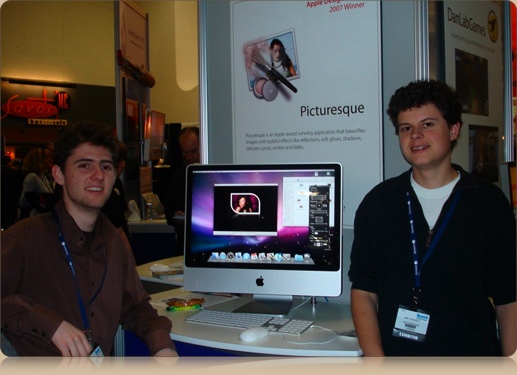
The proud Picturesque developers at Macworld SF, posing with the iMac and new icon.
A free trial version of Picturesque is available from Acqualia’s website – go grab it if you haven’t already!
@anonymous: as much as you’d like it to be her boob, I think it’s her hand…
Oops, deleted anonymous his comment. And yes, it’s not her boob.
He said;
is it just me, or do I see her right boob?
or, what is that?
Thank you for sharing the process, it turned out really nice. great job!
Oops! Picturesque has got a new icon!?
Oh, it’s true and I have to say that I like it very much.
Just updated my version of Picturesque… :-)
It’s interesting to see the progression and the “aha” moment where the utensil is made prominent, similar to shipping OS X apps. It looks great!
A good icon is the best way to advertise a Mac app — it signifies that the authors care about the appearance of their app, so they probably care about its functionality, interface, and code too. Conversely, a lame icon makes me question the application as a whole. And with that, I’m off to read more about Picturesque!
Love the older icon, any chance we could get a download link to have the old icon back?
Thanks.