In a subtle email dropped in my inbox a few minutes ago, Paypal notified me of a new button design. In case I hosted my own buttons, they suggested I downloaded the new “stylish ‘Sunrise’ buttons from (the Paypal) website”. I really don’t ever use the defaults, but they look decent, right? White shape, black font on it, doesn’t really look out of place on any website. Here’s a comparison of the old and new button style. Continue reading…
A brief writeup of an interview, with Steve Jobs on the New York Times website, stated;
In contrast, Mr. Jobs said that multitouch drastically simplified the process of controlling a computer.
There are no “verbs†in the iPhone interface, he said, alluding to the way a standard mouse or stylus system works. In those systems, users select an object, like a photo, and then separately select an action, or “verb,†to do something to it.
The Apple development team worried constantly that the approach might fail during the years they were creating the iPhone, he said.
This is easily noticeable when you use the iPhone, everything seems much more ‘complex’ and ‘fussy’ on the desktop after you’ve used it for hours on end. For example, I started to scroll the wrong way when I came back to my Macbook Pro (something I heard more people have had); everything in the iPhone interface feels like it’s how a ‘physical object’ would react. This only proves how far Apple has went to establish a new, even more user-friendly interface paradigm where they went as far as to challenge existing conventions .
Final Cut Server, Apple’s solution for a centralized video workflow has been highly anticipated since the unveiling of the revamped Final Cut Studio 2. I’ve found an article on unflyingobject with several screenshots and information about the program, so I decided to share my thoughts on the graphical (icon / UI) side of the app with you. In case you want to know what Final Cut Server does and if it’s good at it, I recommend the linked article.

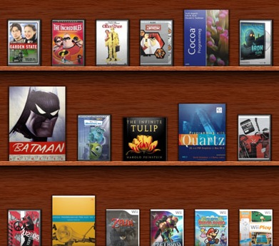
Scott Stevenson has put up a short but very impressive teaser of Delicious Library 2. After the web interface preview of not too long back, this is very nice to see. One of the apps I am looking forward to the most when Leopard comes out (and the iPhone SDK, of course, can you imagine scanning in barcodes wirelessly with your iPhone?).
Apple has announced the release of Leopard, the newest incarnation of Mac OS X. Amongst 300+ new features, it also boasts several graphic enhancements like resolution independence, 512 pixel icons, a reflective dock and new a unified ‘theme’ for application windows. Now, only days before the release, I want to show you some of the major improvements and additions to the Mac software aesthetic.
Cocoia is proud to announce the launch of the fourth major version of the Cocoia blog. As you might have noticed, it’s the first blog theme I made that took me over a day to complete. In fact, I dislike webdesign so much, that it took me weeks to get right. Now that every part of my blog looks exquisit, it is also time to spice up my posting frequency and the material I write about. A few of the additions are ‘read more’ links (introduced in this post), more legible text and logical separation of blog ‘functions’ and content.


