04 Oct
   Filed Under: Gaming, iPhone, Reviews   

Ah, I remember the day when Lights Off was released, the first truly native game for (jailbroken) iPhones. With not even a rumor about Apple’s now legendary and infamous App Store, the game was available for free through the somewhat clandestine Installer app. Designed by Adam Betts and developed by the now Apple-employed Lucas Newman, Lights Off was not only a joy to play, but also beautifully designed.

Rampchamp

It made me incredibly excited about the prospect of native games on the iPhone. Fantastic iPhone-worthy design coupled with addictive games was a reality I couldn’t imagine. That turned out to be a positive limitation on my brain, since the introduction of the App Store has brought about mostly horribly ugly (yet sometimes quite playable) games. It’s Ramp Champ that brought me back to those good thoughts, though.

Continue reading…

29 Jun
   Filed Under: Interface Design, iPhone   

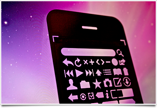
I got the Design Commission’s iPhone UI design stencil kit as soon as it came out, as one of the 100 first customers. I may have been the last one to go before they sold out, as a friend of mine was literally checking out a minute after me and got a message saying they were out of stock.

stencil3

And to make a long story short: I’m quite pleased with it. Upon opening the package, the first thing that struck me was how thin it was — a great ‘feature’, because you don’t want a thick piece of metal between your pencil and the paper. As a bonus, I was also pleasantly surprised to see that they included a thin mechanical pencil.
Continue reading…

21 Jun
   Filed Under: Apple, Interface Design, iPhone   

There’s been so many iPhone OS 3.0 feature roundups that I’m not even going to bother doing a roundup of UI changes, as most users are quite familiar with this newest version of the iPhone firmware already.

3oh

This is a post about the details, but there’s a few things I won’t go into. For instance, please don’t get me started on those pinstripe icons. Seeing them on a huge banner at WWDC was painful enough, and then having to recreate the same stripes for this blog post’s graphic was the proverbial needle under my fingernail.

However, it’s worth a blog post to look at those nice little touches that have been added to the already impressively well-designed iPhone UI.
Continue reading…

27 May
   Filed Under: News, Personal, Personal Work   

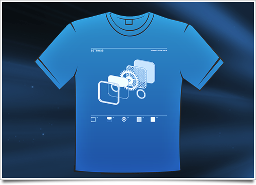
It’s often said that there is great value in having a distinct shirt at WWDC, and while I’m not very preoccupied with that notion myself, I do have great fun in designing shirts. I first wanted to print a larger version of my twitter user picture, but I was curious if I could design something that was a bit more relevant to my work.

smalltee

And I settled on this design. Hey, doesn’t everyone love exploded items on shirts these days? A nice large version of the shirt design is up on my flickr.

I’m printing 6 of these shirts today, and one of them will be sent off to a happy owner in a new giveaway post that’s coming up soon. Let me know if you’d like one of these shirts; with enough demand, I might print a few more.

24 May
   Filed Under: Announcement, Icon Design, iPhone   

As I alluded to earlier today, Sean Patrick O‘Brien and I are working on the very first Mac application that will be released under the Cocoia ‘brand’: Composition. Composition allows you to take any image and get a pixel-perfect preview of iPhone’s default effects at regular home screen size and Settings/Spotlight small icon size. It also lets you look at your icon in a virtual home screen to achieve a native look (and yes, both iPhone and iPod touch home screens will be represented), and export it for further usage on websites and other materials.

compositiom

Composition is not an icon generator or designer in any way; it is made for people who care about the way their icons look, and want to get a break from the horrible workflow of mashing previews of icons together in Photoshop. There will be several easy-to-access Photoshop templates accessible from the app, but the actual design work is left to applications that are excellent at that kind of work. It will also be completely free!

I will announce more news about it as the application nears the beta milestone; in the mean time, drop an email to this address to get a spot on the list.

24 May
   Filed Under: Apple, Icon Design, iPhone   

iPhone icons are gorgeous. The home screen is a beautiful display of icons that have been extremely carefully designed to achieve a stylistic balance. On the desktop, the same applies, but icons have far less ‘rules’ imposed on them, and are generally very diverse in their appearance. One could conclude that there is less consistency in the design of desktop icons than there is in iPhone application icons.

iphone-icon-macro

As a result, icons in the Mac OS X dock also generally have less trouble looking good and blending in with the system icons. There’s simply more room for creative freedom and slight stylistic differences. The iPhone is a different story. I keep all third-party application icons (apart from a few notable exceptions) off my home screen, because they stick out like a sore thumb. Why is this, when it is so seemingly simple to fit into the consistent design standard, and what can Apple do about it?
Continue reading…