17 Sep
   Filed Under: Design, Personal   

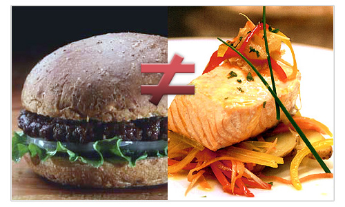
I have an employer with whom I’ve got a very long working record now. That is, he’s one of my longest-running clients, with whom I also have a very good working and talking relationship. We’re always developing new concepts, whether it be in icons, interfaces or other fields of life unrelated to software (hi, D!). Lately, while we were exploring things, we were looking over websites like istockphoto – websites where people can upload and buy stock graphics. Most people I try to reach with Icon Designer and my blog aren’t the people who get their graphics at those places. When I am appealing to people who want to hire me to make custom graphics, it’s like they are pursued go to a very exclusive restaurant that caters to them. They could go to the Fast Food King around the corner and eat what everybody with a disregard for personal health eats, and that’s basically the choice at hand. Considering most people I want to reach want to sell their product, let’s say in this metaphor they are people who need to sell their body. It’s easy, fast and cheap to eat junk food. It’s also bad for them in business.

junkfood.jpg

Now, I don’t want to generalize to say that all stock art is bad. Sure, some stock art can look very good. The problem with stock art is that it’s akin, but worse than, going to a company like “Logo Farm 2000”. This company doesn’t exist (hopefully) but they make a logotype for $200, in 2 days, with 99 designs to choose from. This company also doesn’t really need a brief for the design; a company name will do. With stock art, you buy something and integrate it into your visual identity; the imprint you leave on people, visually, and the emotions and messages you convey are a part of that. With stock art, you go off on your own blind faith in your judgement to chose whatever you like and put it into a context where you feel it fits. There are a few problems with this.

A. Stock art is not made for your company. It’s not made for your product. It’s simply not made for you.

B. Most people are not designers.

Design, especially in logo’s and icons, isn’t about ‘art’. Creativity helps make new, innovative, and inspiring metaphors and ideas to lay a foundation for a well-executed and polished design. Design itself is all about solving problems and finding a great solution for it. There is purpose in all things, in a sense that it is very akin to the development of applications. These two fields meet in the type design business, where people develop a lot of little solutions to make one, unified working whole for which they sell licenses, exactly like software. Although in the software and typeface business, there’s also a market to make custom software for a particular case, which is almost the same as the work I do.

Coming back to my point, if I design something for you, it wouldn’t be cheap. I have had enough email transactions in which people have had second thoughts about the price of my services. I don’t really make concessions (in rare cases) – I’d much rather point you to this post. It surely won’t be as cheap as a logo farm or stock art. The design I make for you will benefit from the working knowledge I have as a full-time designer; I’ve been living and breathing visual design since I was born, and have been sustaining myself with it for years. When I design something, I don’t feel like I’m sitting behind my desk ‘doing my job’; I feel like I’m doing what I was put on this Earth to do. I will strive to create something that you will completely agree to in every aspect; it will communicate to people, at a glance, what you want it to communicate. It’s a unique graphic, tailored to you. It’s also the visual identity of your product, or your company; something that’s hard to put a price on. You can look around you for examples of visual identities; they are ubiquitous today. I’d happily ask some other clients about what they think of the final product I delivered to them; I strive for something that will change your perception of this indefinitely. You’ll start craving the cuisine and never even bother to consider junk food.

Development, for applications, is considered blindly outputting code where the problem is -a- problem, and the only solution is the right one. Non-developers rarely see programming as a creative process, while it’s a very creative one, that touches art on as many (if not more) fields as design. Design, nowadays, is integrated into all the aspects of our life. Everything you meet has been involved with a process of designing visuals for a purpose. Think about type design again; making typefaces changes the actual appearance of our language. You can truly invent in every choice you make. It is exactly the same for software. They’re also goods which require purchase and installation to be useful; that’s much less akin to designing. If you develop software, every choice you take is important and has everything to do with design. Still think of it in black and white? Consider scripting ligatures in OpenType fonts. This means you have to script in certain conditions to make automatic letter contractions work. Great fonts have this. Is this design? Most definitely.

I have presented two matters in which I think people don’t see black and white and people fail to see the weight of custom design. I want to show you, and many others, that design is such an important matter, that we should be grateful for every developer, designer and artist out there. In reality, we are all working together for a grand goal; making everything better.

10 Sep
   Filed Under: Personal   

Yeah, I have this portfolio website, a certain one, not sure if you have heard of it, ‘pictogram maker’ or something similar, and I managed to be such an idiot that I;

A: Forgot to check if my vCard (contact info container) download link worked (it didn’t) and

B: Forgot to add a freakin’ EMAIL ADDRESS on my portfolio.

So I had a (you may start pointing fingers at me and laugh very hard) portfolio, showcasing work, you know, to people, who had no way to contact me. Literally no way. You may stop laughing now. Now there’s a way to make new clients.

Yes, it’s fixed now.

comments off
10 Sep
   Filed Under: Commercial Work, Design   

Acorn, the new image editing program from Flying Meat is out. I found that out just now, as I was rubbing my eyes having just gotten out of bed. This gives me the chance to give a very educated blog post before anyone, uh, more witty can.

In his very funny blog post about ‘redacted.app’, Gus Mueller gave a clever preview of Acorn without spoiling the surprise. Acorn is, as he said in his interview, exactly the opposite from Photoshop. Photoshop’s “stuff”, and Acorn is “anti-stuff”. I’ll spoil a bit here as to why I have such insight in an application that was just released; I was in the Acorn beta while Gus wanted me to do some small icon work. What really astonished me was (apart from the rapid phase of development, a sure sign of coffee love) the way Gus solved a problem in the general image editor’s UI;

acornui.png

Acorn, as you can see, features the conventions we all know in image editors; we have tools, we take them from a palette to draw on a canvas. The result, for most image editors, is a screen akin to an airport where everything is up in the air and floats about your canvas, often obscuring parts or confusing you what palette to go to next. Acorn takes a very clever approach to this (does Gus know any other ways of approaching a hideous problem?); it puts the layer, tool, and color palettes into one. As you can see, this even features the tool’s options neatly in the right place. I’d kill for a version of my favorite image-editing gorilla with such a smart approach to reducing workspace clutter.

But smart placement of the things you need isn’t where Acorn’s features end. Gus has done well in keeping Acorn a simple and intuitive image editor you can just jump into. GPU (or hardware) acceleration, something that Pixelmator, the next hot thing in image editing land, boasts with, is something Acorn modestly lists in its feature listing. It has an intuitive feature for creating gradients, it smooths your pencil strokes, features a very nice fullscreen mode and much more.

Testing Acorn has been a very joyful experience for me, as Gus is very receptive to input and Acorn itself is nothing less than a joy to use. I’m happily buying a license for my girlfriend when I’m getting my next payment. It’s a mere 39,95 – as introductory price. You can test it out yourself or buy it now from his website.

comments off
08 Sep
   Filed Under: Personal   

I’ll be committing myself to redesigning the blog to something that can last for the next year and represents my activities properly. Apart from the regular designing work, I think I have deprived and perhaps alienated my reading audience by reducing this blog to all my personal announcements and releases. I think people who have been subscribing since March or April have been disappointed in the lack of typography, graphic design, technical and personal (light-hearted) blog posts of general interest.

“So what does it all mean,?” I hear you ask. Light-hearted personal posts seem a bit of a drag, and perhaps you fear I’ll be filling up the blog with 40 posts per month again by making all of you very familiar with the 6 kittens I share my (home) office with. No, I’m not intending to go completely irrelevant in a week, but I do want to commit to having a fun blog you can actually find some nice content on that isn’t per-se exclusively mine or some sort of a public announcement. See the obligatory cloud on the right? The ‘announcement’ category has grown out to be one of the biggest. I should, you know, get a *real* site for that kind of stuff, and post news articles slash ‘press releases’ on that. I just want to show the things I think are worth seeing. Time for some examples.

My real-life friend and creative genius Jelmar, for example, has been working on type design well before I started this blog. I have featured him a bit before, but I think his developments are something that warrants him to start blogging; he’s an incredibly clever person in finding words, imagery or curves that appeal to you in such a special way that it sticks with you for very long. In terms of type design and typography, his latest brainchild was Ace, an unfinished design for a typeface he posted in his flickr photostream;

Although it lacks kerning at this point (in layman’s terms, letter-spacing) it is evident this is a very original and strikingly beautifully designed typeface. You can check out his website, Typehigh, for more of his typographic designs; I can assure you he’s got a very nice lineup of typographical styles already, as well as some great print design and photography.

When I was mentioning kittens, it would be a bit harsh for them if I were to completely disregard them on my blog. I mean, they’re very sensitive in this stage. I decided to toughen them up with my Canon dSLR’s flash. Makes them manly.

IMG_0677.jpg

Fuzzy doesn’t even come close to describe them.

It’s also, speaking as a geek, a technically interesting thing to see that these, well, basically automatons at this point, who have just gained vision since two days, crawl about aimlessly and have now – completely by accident – found the exit of the ‘tent’ they once entered the world in, and thus, are crashing out of it like lemmings from a cliff, continually making a soft, whiny, meowing sound as they progress towards their certain plummeting.

It’s quite interesting to see, because they don’t seem to learn at all; I mean, they are basically unable to causally see the relationship between them moving forward and falling off the edge. Comically, they do manage to solve the problem; one could say they have a special ‘exception handler’ if they can’t achieve something after trying basically a hundred times. And it looks like this:

kitten-exception-handler.jpg

The Chinook- er, I mean, mother cat just comes to pick them up like a carryall did with harvesters in Dune. Brilliant hardcoded goodness.

Well, that’s more than enough kitten for September, in my opinion. I’ll be updating the blog very, very soon now (I’ve actually got the design done, so I would imagine little stands in my way to start working it into a wordpress theme) and I will do a lot more fun, loosely related and experimental posts in the time to come.

ps. – no kittens were harmed in the making of this blog post. No, really, I dimmed my flash.

05 Sep
   Filed Under: Announcement   

You probably haven’t noticed, but it’s been the most huge blast of a day for me since, well, ever. Today was not just the release day of the new Icon Designer (which is still sliced, so sue me), but I also took the lengthy three-hour trip to Amsterdam to meet up with Jasper, Hugo, Dirk and Koen of MadebySofa. I also met the ex-Sofa intern, Jorn, who blogged a while about his experiences in the team. As a Dutch powerhouse of neat interfaces, icons and applications, MadebySofa has been inspiring for me so far, and today has only intensified my respect for the crew.

Here’s a photo shot by Dirk, kind enough to replace my frantic blurry photoboothing of the crew.

We discussed various things, had some great lunch and showed each other work. For me, it’s been the first time I ever met another icon designer, let alone Jasper Hauser, so it really was like coming home. I felt a bit sorry having to leave in the afternoon to make sure I could get a new battery for the Macbook Pro on the way home so I could get some work done, but the day was fantastic and more than worth the extraordinary traveling fees of the public transportation here. MadebySofa’s still Europe’s (the world’s?) only and best Mac team when it comes to interaction and interface design, and I feel honoured to work and talk with them. I spent an hour or so working on Icon Designer and sending emails to clients, as a part of the crew was out for a bit of the day celebrating Hugo’s birthday (happy one again, Hugo!).

So, enough for the great day I had in Amsterdam, on to the fresh meat. What do I have in store for you? Icon Designer has had layout, loading time, and graphic tweaks and changes, and now features two new icon sets for you to download freely. As space was getting scarce, I added a page containing all my freeware work so far, updated my client work with a few new icons I was allowed to show, and testimonials of very happy clients. I also added an about page, so you can read a bit more about me, and see how the process of icon design goes in general. I hope you like the additions and tweaks to Icon Designer and if you enjoy it, please drop a comment or an email; it makes me feel like making the freeware sets and the website is worth my time. Also check out MadebySofa, the greatest designers and developers out there in our low lands, and stay tuned for interesting developments down the road.

Update; added a picture shot by Dirk. Click it to read Sofa’s notes (and see who’s who).

05 Sep
   Filed Under: Design, Icon Design, Personal Work   

In all the recent blogging about the Leopard dock, mostly negative, I decided to see if i could come up with some icons that go well with the new dock’s look. For the uninformed, the Leopard dock has a reflective ‘table’ underneath, which stirred a lot of commotion into the Mac community as being way over the top, too inspired by project ‘Looking Glass’ by Sun, and being very ugly when pinned to the left or right side of the screen.

Personally, I’ve been a bit quiet about the interface and icon developments in Leopard for the simple reason that I now have Leopard complete with the NDA that comes with it and I can’t disclose much, let alone make elaborate reviews on its (not even finished) interface elements. But honestly, I dig the Dock. In response to all the negative input, I much rather dislike the Tiger default dock, with the odd semi-opaque white rectangle behind it and the unclear separators. The Tiger dock has a very big issue with seeming ‘cluttered’ when either non-Apple icons or more than 9 icons are in it. Apple seems to have noticed, and put icons on a plane, extending the natural ‘tabletop’ perspetive. The Rogue Amoeba blog pointed out that this table perspective placed on the side of the screen doesn’t work, but I’d like to respond to that that in general, as icons are developed for the particular ‘tabletop’ perspective, that any dock doesn’t really work well when placed sideways. According to the guidelines, icons are just not meant to be placed on top of each other, but next to each other. We also read from left to right, not from the top to the bottom, so placing the Dock at the bottom is a natural thing to do, and I rarely see people doing otherwise.

Of course, redundant shadows bug me too. Of course, I think reflecting window contents and the desktop background goes a bit far. But has it bugged me since using Leopard? No, it hasn’t. With the new default wallpaper, you never notice the extra shadows (which is why I suspect Apple plans to take them out, and if they aren’t, there’ll be tools to do so faster than you can say ‘ihateit’) and the whole looks very unified and beautiful. Here’s a shot of my dock on Leopard;

Picture 1.png

As you can notice, a few icons stand out as seeming to be made for this new Dock. I’d say the Time Machine icon looks really good on it. But I want to point out that the four-legged assault droid that I use as my dock separator actually uses it as a design element. It’s been made specifically for the Leopard dock, and it strengthens the look of the icon. I created this very small new icon set to explore the possibilities. You can download the set now, on Icon Designer.

WoBD-Terminal_256x256.png

Notice how these two icons wouldn’t have been as strong in the Tiger dock, but really gain in power and meaning in the new dock. The conclusion? Adapting to the changes in the interface of Leopard can only be done by icon designers who find creative solutions. You can always make things look good, as long as you are creative.

comments off