13 Mar
   Filed Under: Commercial Work, Design, Icon Design, iPhone   

A while ago Buck Wilson, the designer in a small team of Portland-bound guys, contacted me about icon design for Here, File File!, an iPhone app that lets you connect back to your Mac from anywhere and read, view, and stream your files. As opposed to the popular Dropbox and iDisk apps, it allows full access to all the files on your Mac, instead of just a few hand-picked ones.

I happily started working for them to make a kick-ass icon. There was an additional challenge as multiple icons were required: a Mac icon, a menubar icon, and an iPhone icon, which required a metaphorical connection between all of them. Buck mentioned they had an idea for using a doghouse for the Mac app and a dog with files on the iPhone, but I recommended against using animal motifs. Not only do we have the classic divide between ‘dog people’ and ‘cat people’ to worry about; animal motifs are just not very suitable in iPhone icons.

Continue reading…

01 Feb
   Filed Under: Goodies, Icon Design, iPad, iPhone   

Update: Get the updated version.

As there’s a tendency lately to release lots of (often less-than-pixel-accurate) PSD templates of iPad UI elements, I’ve decided to work with my good friend, Sean Patrick O‘Brien to create a PSD based off the exact overlays, outlines, and masks the iPhone and iPad OS use to mask icons.

This lets you preview the pre-supplied gloss, or modify it. It’s made up entirely of shape layers and layer effects and should be completely pixel-accurate. If you use it, credit is welcome — it’s not required, though.

I’d appreciate it if you let others know about the PSD if you grab it. Tweet this or blog it. Thank you!

iPhone Resource will obviously have templates like this with actual sample icons (and some recreated Apple icons) once it’s out. Consider this a small goodie until iPhone Resource and Composition is out (yes, the latter is in development, but it’ll take much longer than expected).

12 Dec

Warships, a game designed by me and developed by the Canadian Edovia is now available on the App Store. It’s a great, simple game of naval conflict, and I had a lot of fun designing it. You should get it (while it’s still a mere $1!) here.

warships-the-game

However, I won’t be doing a lengthy post on its design process this time around. Instead, I made a video in which I tell you a bit about the process and show off some timelapses of the game graphics and icon. Consider this an experiment, and let me know what you think!

Viewing in HD at Vimeo is recommended!

04 Oct
   Filed Under: Gaming, iPhone, Reviews   

Ah, I remember the day when Lights Off was released, the first truly native game for (jailbroken) iPhones. With not even a rumor about Apple’s now legendary and infamous App Store, the game was available for free through the somewhat clandestine Installer app. Designed by Adam Betts and developed by the now Apple-employed Lucas Newman, Lights Off was not only a joy to play, but also beautifully designed.

Rampchamp

It made me incredibly excited about the prospect of native games on the iPhone. Fantastic iPhone-worthy design coupled with addictive games was a reality I couldn’t imagine. That turned out to be a positive limitation on my brain, since the introduction of the App Store has brought about mostly horribly ugly (yet sometimes quite playable) games. It’s Ramp Champ that brought me back to those good thoughts, though.

Continue reading…

29 Jun
   Filed Under: Interface Design, iPhone   

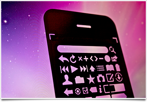
I got the Design Commission’s iPhone UI design stencil kit as soon as it came out, as one of the 100 first customers. I may have been the last one to go before they sold out, as a friend of mine was literally checking out a minute after me and got a message saying they were out of stock.

stencil3

And to make a long story short: I’m quite pleased with it. Upon opening the package, the first thing that struck me was how thin it was — a great ‘feature’, because you don’t want a thick piece of metal between your pencil and the paper. As a bonus, I was also pleasantly surprised to see that they included a thin mechanical pencil.
Continue reading…

21 Jun
   Filed Under: Apple, Interface Design, iPhone   

There’s been so many iPhone OS 3.0 feature roundups that I’m not even going to bother doing a roundup of UI changes, as most users are quite familiar with this newest version of the iPhone firmware already.

3oh

This is a post about the details, but there’s a few things I won’t go into. For instance, please don’t get me started on those pinstripe icons. Seeing them on a huge banner at WWDC was painful enough, and then having to recreate the same stripes for this blog post’s graphic was the proverbial needle under my fingernail.

However, it’s worth a blog post to look at those nice little touches that have been added to the already impressively well-designed iPhone UI.
Continue reading…