28 Jan
   Filed Under: Apple, Icon Design, Interface Design, iPad, News   

Unless you’ve been living under in a multitude of nuclear holocaust-proofed rocks, you’ve heard all about Apple’s new tablet, the iPad.
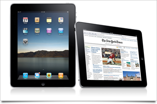
As usual with a large Apple product launch, I’ve written up this post to round up the good, the bad, and the ugly of all the new interface and interaction designs that were set loose on the world by the company that’s regarded as the most influential and skilled when it comes to designing experiences. The usual disclaimer applies: iPad hasn’t hit the market yet, and thus its UI may still be subject to change or improvement.

Continue reading…

11 Sep
   Filed Under: Apple, Interface Design   

It’s that time again: A new big cat is upon us, and while it hasn’t brought about the rumored ‘Marble’ aesthetic, there’s been a lot of enhancements, tweaks, and improvements to the user interface and graphics of Mac OS X 10.6, commonly known as Snow Leopard.

After a huge release like Leopard, which brought very radical change to the way our favorite OS looks, feels, and works, including a complete redesign of its icons and UI ‘theme’, Snow Leopard’s (incomplete) roundup of UI changes can only feel minor. Nevertheless, it shows some beautiful classroom examples of what composes true attention to detail.

snowleopard-ui

Since Snow Leopard has quite a few interface changes and tweaks, I’ve organized them into four sections. I’ll kick off with the most visible changes, and round the article up with (very) minor tweaks that are hardly noticeable, but show us that Apple still hasn’t lost its touch.

Continue reading…

21 Jun
   Filed Under: Apple, Interface Design, iPhone   

There’s been so many iPhone OS 3.0 feature roundups that I’m not even going to bother doing a roundup of UI changes, as most users are quite familiar with this newest version of the iPhone firmware already.

3oh

This is a post about the details, but there’s a few things I won’t go into. For instance, please don’t get me started on those pinstripe icons. Seeing them on a huge banner at WWDC was painful enough, and then having to recreate the same stripes for this blog post’s graphic was the proverbial needle under my fingernail.

However, it’s worth a blog post to look at those nice little touches that have been added to the already impressively well-designed iPhone UI.
Continue reading…

16 Jun
   Filed Under: Personal   

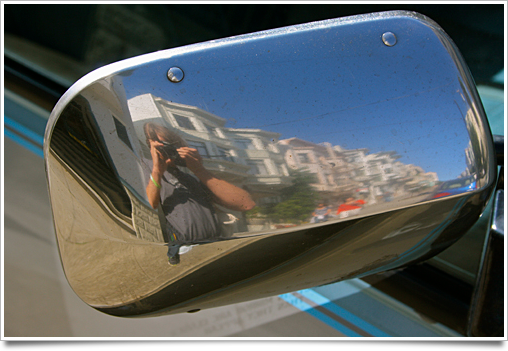
Wow, that was fun. A couple of awesome days in San Francisco with over half of the Mac and iPhone community walking around, meeting great people, having great food, and even seeing a keynote.

image4

In this post, I quickly summarize my impressions of WWDC, and show off my last photos and an HD movie of the queuing for the keynote, getting some shirts printed, a pigeon, and much more.

Continue reading…

07 Jan
   Filed Under: Apple, Design, Icon Design, Interface Design, News   

Of course, I watched the Macworld SF keynote yesterday, and apart from noticing the iWork.com icon, I also saw all sorts of nice UI changes and icons. I skimmed through Apple’s new online guided tours and walkthroughs and I’ve compiled a (far from exhaustive) roundup of all the fancy new UI stuff in the iWork and iLife ’09.

I’ve divided this post into areas of interest, and not by application, as I have no access to iLife ’09 yet, and I think that the changes and additions to the interface design serve themselves much better to being divided into logical groups that go beyond just the product itself.

Continue reading…