24 May
   Filed Under: Announcement, Icon Design, iPhone   

As I alluded to earlier today, Sean Patrick O‘Brien and I are working on the very first Mac application that will be released under the Cocoia ‘brand’: Composition. Composition allows you to take any image and get a pixel-perfect preview of iPhone’s default effects at regular home screen size and Settings/Spotlight small icon size. It also lets you look at your icon in a virtual home screen to achieve a native look (and yes, both iPhone and iPod touch home screens will be represented), and export it for further usage on websites and other materials.
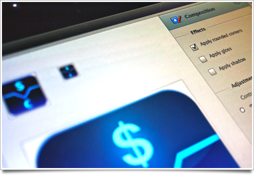
compositiom

Composition is not an icon generator or designer in any way; it is made for people who care about the way their icons look, and want to get a break from the horrible workflow of mashing previews of icons together in Photoshop. There will be several easy-to-access Photoshop templates accessible from the app, but the actual design work is left to applications that are excellent at that kind of work. It will also be completely free!

I will announce more news about it as the application nears the beta milestone; in the mean time, drop an email to this address to get a spot on the list.

24 May
   Filed Under: Apple, Icon Design, iPhone   

iPhone icons are gorgeous. The home screen is a beautiful display of icons that have been extremely carefully designed to achieve a stylistic balance. On the desktop, the same applies, but icons have far less ‘rules’ imposed on them, and are generally very diverse in their appearance. One could conclude that there is less consistency in the design of desktop icons than there is in iPhone application icons.

iphone-icon-macro

As a result, icons in the Mac OS X dock also generally have less trouble looking good and blending in with the system icons. There’s simply more room for creative freedom and slight stylistic differences. The iPhone is a different story. I keep all third-party application icons (apart from a few notable exceptions) off my home screen, because they stick out like a sore thumb. Why is this, when it is so seemingly simple to fit into the consistent design standard, and what can Apple do about it?
Continue reading…

18 May
   Filed Under: Personal   

I really resisted the idea of writing a bit about myself, initially, but this year I was interviewed by newspapers and on radio shows and it seemed weird to not have something up on the place where I ‘live’ my professional life: on the internet. I think it’s also good to have something to link to for the ‘About me’ button.

me

Who are you?


I am Sebastiaan de With, a 2122 year old freelance designer and one-man company. I specialize in icon and visual interface design and consultancy, but I also design logotypes, and maintain a blog and a website service that teaches you how to design icons. I occasionally do presentations for teams and companies, too, on making apps that are beautiful and fun to use.

I live and work in my own studio in the northern region of the Netherlands, a tiny country in the west of Europe. I love Macs, technology, gaming, reading well-written stuff, mecha, and kittens – but that should be obvious. Everybody loves kittens.

Continue reading…

16 May
   Filed Under: Goodies, Icon Design, Personal Work   

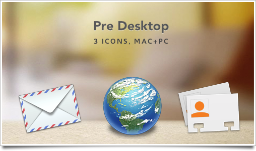
Sometimes, I like to do a little bit of icon speed drawing. Like with my iWork.com icon goodie, I completed these icons in a short time of about 2 hours total. I really like the Palm Pre‘s web browser icon, so I speed-designed 3 of the nice-looking icons on the Pre’s launcher screen for usage on your Mac or PC.

predesk

They’re not amazingly detailed or even polished at their maximum size of 512 pixels, but that wasn’t my intention, either. Consider that a disclaimer before you start commenting that they don’t look nice enough to you at that size ;).

These icons are intended for personal usage and desktop customization only. Palm Pre, the Palm branding and its icons are © 2008-2009, Palm.

16 May
   Filed Under: News   

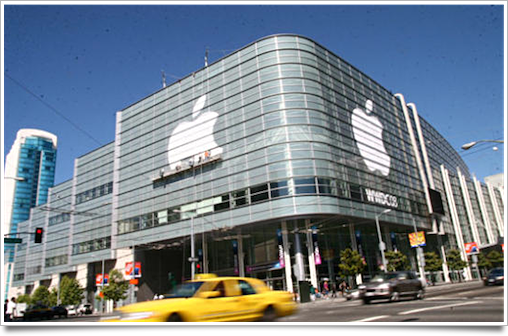
It’s a first for me; I’ll be in town June 3rd – June 14th. I’m a bit too poor to actually go to the Moscone and check out sessions that are focused on developers, so I’ll just be going across town meeting people and working.

The Moscone

I got quite a few emails already from people and companies that would like to meet up; as the schedule is quickly filling up, if you’d like to connect, let me know early!

I intend to visit Japantown and North Beach more this time around. It’s my fourth time going to San Francisco, so I haven’t nearly seen enough of the awesome city that is San Francisco yet.

Are you going to WWDC? I’m taking suggestions on toy shops and great restaurants for the time that I’m over. Now that I’m 21, I can also check out more of the night life. Some sweet places I found in the past are shops like Double Punch in North Beach and Cesario’s, a pretty good Italian restaurant near Union Square.

14 May
   Filed Under: Goodies, Personal Work, Wallpapers   

The Ubiquity logo was finished in my series of ‘Inside Job‘ posts, but I think few of you have peered this deeply into the eyes of Ubiquibot, the new official logo and mascot of Mozilla LabsUbiquity.

ubiquipreview

Ubiquibot’s wallpaper comes in ‘Clean’, ‘Evil’, and ‘Good’ variants, all in glorious 2560*1600 pixel size. Enjoy!

This wallpaper is intended for personal usage and desktop customization only. Ubiquity and its identity is © 2008-2009, Mozilla.