Armin Vit posted about the now-in-beta Office 2010 on Brand New, a blog about branding. Naturally, they showed off the new(-ish) Office 2010 branding, and, unsurprisingly, the application icons of Microsoft’s latest version of Office.

I wanted to share a few of my observations on the new icons and the history of Microsoft Office and its icons.
Let’s just say that Microsoft Office and icons have an interesting relationship with each other. You could consider them to be very monogamous couple.
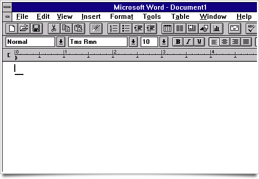
With the release of Microsoft Word 3.0 in 1992, Microsoft included a so-called ‘toolbar’ with a set of icons in it that represented key functions of the program. You may be familiar with these icons:

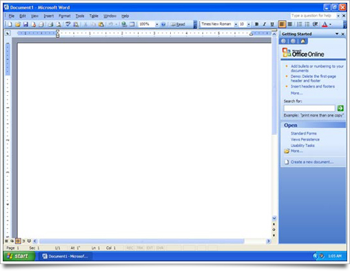
While they were colored in the next versions, it would take an astonishing eleven(!) years for them to be replaced by only marginally different icons, in line with the Windows XP visual style (known as ‘Luna’ – or, as some fans call it, ‘Fisher Price’). The metaphor would remain virtually identical, and the perspective and shape slightly reworked, but Office and its toolbar icons were still a happy couple until toolbars were replaced with the new ‘Ribbon’ toolbar design.

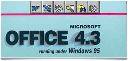
The same goes for its application icons. I’ve had some trouble finding clear and clean pictures of yore showing the icons in their full glory, but I think we can all agree that MS Office 4.3 shipped with these:

The iconic ‘W’ for Word, the key for Access, the Excel X, are all recognizable as monuments in icon design. They have been practically unchanged throughout Office’s many version increments. As the suite grew, Outlook, Powerpoint and Publisher joined the family, seeking some of that truly iconic design for themselves. And indeed, their metaphorically significant design elements were maintained for several generations.
![]()
The Mac suite opted for a different type of icon design that fit in a lot better in the OS X dock, which goes to show Microsoft does care about looking (or acting) native. Something you honestly wouldn’t expect, considering the abhorrent mess known as Microsoft Messenger for Mac.

The Windows variants of the suite got a re-imagination in Office 2007, but the metaphors that had been established since the first versions of Office were still used as the primary recognizable element.
![]()
Until Office 2010.. In a fit of what can only be described as Adobespiration, Microsoft claims:
“The new icon designs respond to research that informs us that users can more easily associate icons by letter and color than by abstract design. We’ve adopted an alphabet system to bring a more uniform approach to the wide variety of Office family products.â€
This is, of course, a rather thinly veiled attempt to mimic Adobe’s hugely successful (er, hum.) icon design strategy, which has forsaken their traditional, more metaphorical icon design and replaced it with bland colored squares coupled with slightly embossed letters. I’m not sure if they can still be called ‘icons’ in their own right – perhaps ‘indicator’ or ‘hint’ is a better word. Regardless, Microsoft has put their eighteen-year old metaphors in the icon’s background to put a few letters in the spotlight.
![]()
I’m just glad they haven’t switched the colors, so that still stands as a connection that goes back to the computer software bronze age. They have, however, forgotten about computer users sometimes being color blind.
Oh well, so much for icon design research, I guess.


Haha, I love the first image of the post.
And yeah, I am also colorblind, and I see mostly idental ‘P’ icons. Pee indeed.
I wrote about this a while ago on my DevArt Journal (http://dthought.deviantart.com/journal/27058472/) as I’d made a series of icons to replace the Adobe periodic boxes (for better or worse, I understand why they did it, I just don’t like them ;)
My main issues with it were:
* No differentiation of silhouettes
* Overloading of letter meanings, P especially, where at 48, 32 and 16px the supporting elements are unrecognisable
* General dismay at the state of poor iconography for multiple applications where all we’re getting are unoriginal coloured boxes with lettering
I couldn’t agree more with what you’re saying, I can see they have somewhat tried to keep a theme? But there is no evolution or pushing of boundaries :(
I think this is what happens when you design icons from a business perspective, not the end user’s perspective.
In other words, it’s clear to the business owners that all of these products belong to a single application suite. But is that something that the end user even pays attention to or cares about?
This new icon set emphasizes the family of applications and takes the emphasis away from the individual applications. Is that something that’s really important to the user? In other words, how likely would someone be searching for a file or application with the mindset: “I’m looking for something from the Microsoft Office family, not exactly sure what…”? I’d reckon they’d be more inclined to search for things with a specific application in mind, ie: “I’m looking for an MS Word file!”
I think the icons themselves were executed nicely given the objective. However, I think the objective itself was flawed to begin with.
Well said, Ryan.
Honestly, I hope more and more large applications and application suites go with the Letter + Colour combination and completely lose their visual distinctness in a sea of bland alphabet soup.
Then, maybe people will finally come around to the fact that letters are not icons. One can dream.
Is there a reason why three different “P” icons are somehow more logical at a glance than the very distinct metaphors in older Office versions? Why aren’t the letters the same size? (notice the V and W, the A and the X and the I and the N) Why is that Office Tools icon suddenly an iPhone icon? Why is the light a perfect 90° on the left?
Why did Microsoft hire a guy who claims that his “brother knows a bit of Photoshop”? Why do I suddenly care?
Great entry as usual, Sebastiaan.
Oh shit, those new Office icons are really repugnant. Something must have gone wrong, because they look like they’ve been DESIGNED with Office.
The next thing to watch out for from Microsoft:
“Ribbon Hero” – a game for Word, PowerPoint, and Excel
http://www.officelabs.com/ribbonhero
Amazing article. Thanks!
This article has a picture showing the full application icons in Office 4.3: http://articles.techrepublic.com.com/5100-10878_11-5034408.html — the italic W in the Word icon here was a stylistic departure from the icon in the previous version of Word for Windows, but I can’t find any pictures of the previous one.
Office 97 changed them again to a different style with a rotated square as a background element: http://www.ncagr.gov/images/logos/MSwordIcon.gif
And for historical interest, the old Microsoft Word for Macintosh icon:
http://www.timberhillscomputing.com/Timber_Hills_Computing/Document_Update_files/Microsoft%20Word%20Icon.jpg
Considering they are icons that belong to the same suite, there has to be some level of consistency which in all fairness Microsoft have achieved. Similar to Adobe. The thing they’ve failed to take into consideration (I can only guess they haven’t from those images provided) is that the majority of icons in Windows are mostly the smaller sizes. (16, 32 and 48px. 24px too I think?) I’m having trouble identifying what some of those illustrations are in half of those icons and using the “Adobe style” letter in the icon is no help at all. Especially when most of them are the same.
Take that icon on the bottom row second from the left for example. I have no idea what that represents, not to mention the white to transparent gradient going from left to right restricting half of the illustration part. And then you’ve got colour blindness or partially sightedness to take into consideration.
And what about that settings (?) icon? That was obviously a last-second job thrown in there.
Its pretty obvious that the company that were commissioned to make these icons (if there was one and this wasn’t an in house affair) took inspiration off of Adobe. Which is a bit frightening. But in comparison, Adobe’s icons seem amazing.
Ryan nailed it. The icons are designed with an eye towards packaging, not how they are going to look in a dock or task bar.
The current Office icons on the Mac were originally designed by Landor Associates in 2004: http://www.user-experience-blog.de/archives/2004/08/ms-office-2004-icons.html
And although I have no inside knowledge of the situation, I suspect that the same is true for the new Office icons on Windows and Adobe’s recent rebranding of the Creative Suite.
It’s abhorrent that customer experience with sales and marketing is trumping the user experience in engineering the product. Buying a product is a one-time event, whereas using the product is a daily affair.
-ch
@Craig: Well said, and nice bit of info on the Office for Mac icons. I suppose MS marketing realizes that after the sale has been made, the design really is secondary.