


I must be killing all of you with the excitement of the release tomorrow but I just wanted to show how great it is for me now that I happily run MarsEdit 2. It’s a great piece of desktop blogging software, originally by Ranchero (the guys behind NetNewsWire) but it’s been acquired by Daniel Jalkut of Red Sweater Software. Daniel has done some great work on MarsEdit, from giving the interface some much-needed spit and polish (including some great icons) to Flickr integration, which allows me to share with my frequent blog readers that I, too, have a new flickr account with icon sketches and icon designs that I will also use a lot more in the future. Here’s an easily added image of my Flickr sets that I put into this blog post with a simple click;
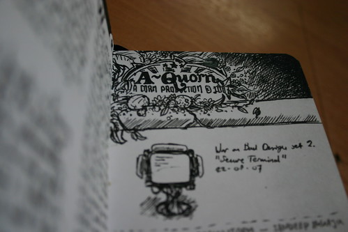
The image above is the new Terminal icon replacement for the War on Bad Design set, which had been teasing the 110 viewers of my photostream since a few days already, and will now serve as the final teaser before everything will be new again. Stay tuned, and if you blog, check out the two-point-oh of MarsEdit here (it’s a free trial for unregistered users!).

When John Gruber pointed out that there was a preview of Nokia’s new *cough*original*cough* design for a phone, I looked at the photo’s, I watched the small, low-res video, and I fell on the floor and died. At least, part of me died.
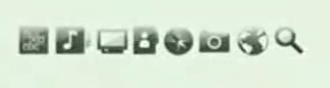
This little shot above is not the icon design of the latest and greatest just-over-a-hundred-dollar (or euro) MP3 player with color screen. It is also not the PSP’s icon design. It’s actually Nokia’s idea of ‘cutting edge design’ which is supposed to compete with, uh, this. Let’s make a bit of fun and guess what the icons are for, from left to right. Starting left… uhh? I think I can make out vaguely that it is a rectangle with text smeared on it. One would logically assume this is the most important ‘thing’ you can click, as it’s way on the left, where your eyes start scanning the row of icons. Can’t make that out. Next to it; music. Way to go not copying Apple’s general grouping of ‘entertainment’, as Nokia has done in previous phones like the N95. A lot of icons follow that are either crystal clear (uh, a TV screen), completely unclear (a file? A person?) and completely ripped off (a compass??).
I am having the feeling that Nokia, who hasn’t been a great choice for people who like nice icons on their phone until now, doesn’t really hire the right people for the job here. I mean, general opinion is one thing here, and you may or may not like such mashups of the PSP and iPhone icon design, but there’s something you can see easily here; The iPhone’s icons are not only a lot more discerning (in general and from each other), they actually have more factors to discern by. They have color, for one, and they are also logically separated.
I live in Europe, and as such, the Nokia phone is the phone you see most often. I always amaze myself at the incredibly complex hierarchy of menu’s and the placement of functions. Me, and I think about every ex-Nokia user over the ocean is eagerly tapping fingers until the iPhone arrives, waiting for the horror of searching through 10 menu’s to find that one application or bluetooth setup utility.
This may seem like a huge rant about Nokia gone bad, but I’d rather want to show you what makes Apple special. It’s knowing what people you hire and even then, checking them and running them by a design philosophy that’s proven and about as simple as it can get. I want to thank Nokia, even, for a great example of where we don’t want to go when it comes to icon design.
ps. Yes, I know September 5th is close. The work is killing me but it’s proving to be quite an awesome release soon. Stay tuned!
Following up on the hugely popular icon set, the successor of the War on Bad Design icon pack is quickly advancing. As it will be released hand-in-hand with the biggest release on Icon Designer so far, I anticipate the reception will be quite good. Are you looking forward to it? Let me show you what’s in store for you; not just folders with shrubs and trees and sheen, but four-legged assault droids and hypermodern covert-ops hardware!

There’s a whole new touch of magic realism to the latest sets. I am, as always, looking forward to suggestions for the next sets, and your input. I’ll see you all again in September with the new release!
Wow, what a blast. The last four days could only be described as my second Lowlands that left me completely in awe. Large acts on this festival included Mika, Gabriel Rios, Basement Jaxx, Chris Clark, the Editors, the Kaiser Chiefs and Tool. And to Tool I went.

My head should be about at the horizon of human bodies at the left. My girlfriend, quite a bit less large as I am, is hidden by all the people. As it might convey, it was a nuthouse of people pushing, throwing beer, hitting me and more of such annoying things, but that utter and complete torture of the body was well worth massaging the soul with the purely amazing show and music.
But Lowlands isn’t entirely about the music (although I was swinging at acts like Orishas, Clark, Air Traffic and Ojos de Brujo), it’s about the atmosphere, food, and people. I really enjoyed it from setting up the tent to driving home at 5 AM. So much for my vacation, back to the daily icon life.
Noble has been selling great, and I found myself engrossed in email when I came back. I will, given my degree of exhaustion, keep it at this limited price today, but I will set a new base price tomorrow; €50,-. I think a price cut can be justified, and I won’t hear anyone complaining about that, I think. To all people who got the set; I will be sending your package out today.
I’ll make some new refreshing posts soon to show my progress in the days that I am picking up work again and I want to thank everyone for the kind input and messages I got while I was away.
I’ll be out starting tomorrow and you can get Noble with 70% discount starting now. Grab it at the Icon Store if you need some icons. Do note that I won’t be able to email out the icon sets and licenses until I am back, but I’ll send them as soon as I get home.
Now for something to keep you sweet all the days that I am away; a little new preview of the folderset. Unorthodox nature motives! Check out the preliminary unpolished Aqua, Anodized and Wood variants;

Input very welcome! Now, I’ll see you all again August 20th – I’ll be sure to enjoy myself with the music, atmosphere and people.

I wanted to announce a few other things. First of all, I will celebrate a whopping three days of vacation at Lowlands 2007, a musical festival that is all about atmosphere. You there? Spot me and get a free drink (it’s the guy in the Cocoia t-shirt, duh).
More importantly for all blog readers; as I have announced yet another War on Bad Design icon set it makes all the more sense to do some price-slashing! In the days that I’m out (starting thursday, August 16th and ending monday, August 20th), Noble, my stock icon set, will be discounted to a mere 30 euro’s. Be snappy and get it while it’s hot (and practically free – had I mentioned to you you get addon packs for free and a lifetime of free use?). And who knows, if sales are going well, I might stick with the price.