


After playing around a bit in the newest version of Mac OS X Leopard, I was delighted to hear that there were several nice improvements to icons and interface elements. Here’s what I’ve found and seen so far;

– Time Machine menu bar icon; when backing up, shows a beautiful animated clock with hands turning backwards, or when unable to back up, presents a tiny caution sign. Very nicely designed, clean, clear, and a great way to keep tabs on Time Machine’s activity.

– iCal icon now localized; whereas the iCal icon got a new feature in 10.5, namely, dynamically showing the correct date on the icon, in 10.5.2, the three letter initials for the month in the top-left corner of the icon is also changed according to your locale. Via Fernando Lins.
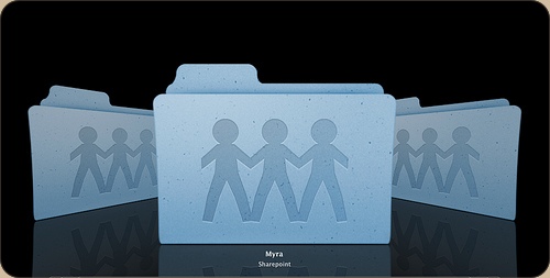
– Sharepoint icon debacle; And then there’s the uglyness. The Share Point icon, first a folder with a globe overlaid, has been changed to a rather cheesy lineup of weird child-human-like shapes.
Apart from that, I’m glad that we now have an option to turn the menubar non-transparent (although I like transparency and would like to see that design concept mature like it did on the iPhone, i.e. a contextual menubar) and that drop-down menu’s are now slightly more opaque. Overall, this update brings some very nice new designs and details to grace your Mac interface.
