02 Feb
   Filed Under: Personal   

By no means a replacement of the Cocoia Exploded Settings tee, but I wanted to wear this and I was told others enjoyed it as well. Represent the new era of online video – which plays fullscreen without crashing your Mac, hopefully.

This shirt will be available soon for a limited time. Drop a comment if you’d also like one. Price will be 22.50 for any size of American Apparel, due to the slightly higher print costs that go with the three-color high-quality printing process.

01 Feb
   Filed Under: Goodies, Icon Design, iPad, iPhone   

Update: Get the updated version.

As there’s a tendency lately to release lots of (often less-than-pixel-accurate) PSD templates of iPad UI elements, I’ve decided to work with my good friend, Sean Patrick O‘Brien to create a PSD based off the exact overlays, outlines, and masks the iPhone and iPad OS use to mask icons.

This lets you preview the pre-supplied gloss, or modify it. It’s made up entirely of shape layers and layer effects and should be completely pixel-accurate. If you use it, credit is welcome — it’s not required, though.

I’d appreciate it if you let others know about the PSD if you grab it. Tweet this or blog it. Thank you!

iPhone Resource will obviously have templates like this with actual sample icons (and some recreated Apple icons) once it’s out. Consider this a small goodie until iPhone Resource and Composition is out (yes, the latter is in development, but it’ll take much longer than expected).

01 Feb
   Filed Under: Apple, Design   

Mike Matas is a very talented 23-year old designer from the United States, currently living in San Francisco. He’s best known for his design work on the original Delicious Library, and working at Apple, designing key parts of Mac OS X and iPhone OS. He’s even been listed as co-inventor on patents Apple has filed.

In 2009, he left Apple. Lately, he uploads the fruits of his also impressive photography skills to his website and blog, mikematas.com.

I’ve asked him a few questions in this interview to learn more of one of the designers of the most innovative and beautiful interfaces of the last decade. Unfortunately, he wasn’t willing to disclose what he’s working on these days, but I’m sure we’ll see a lot of quality design from his hand in the future.

Continue reading…

28 Jan
   Filed Under: Apple, Icon Design, Interface Design, iPad, News   

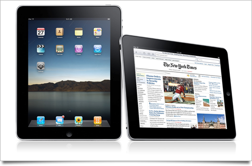
Unless you’ve been living under in a multitude of nuclear holocaust-proofed rocks, you’ve heard all about Apple’s new tablet, the iPad.

As usual with a large Apple product launch, I’ve written up this post to round up the good, the bad, and the ugly of all the new interface and interaction designs that were set loose on the world by the company that’s regarded as the most influential and skilled when it comes to designing experiences. The usual disclaimer applies: iPad hasn’t hit the market yet, and thus its UI may still be subject to change or improvement.

Continue reading…

25 Jan

In August last year, I decided to hold a limited sale period for Icon Resource, since I was about to upgrade it with new content for existing members. I like giving people free upgrades whenever possible: Icon Resource was always meant to be an ongoing project, and it still is. However, it’s taking longer than expected to roll out the new websites. It’ll certainly be worth the wait, though!
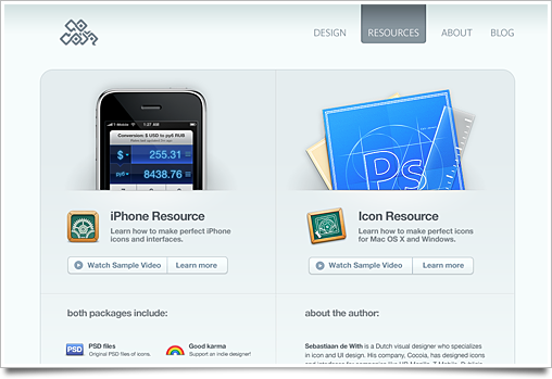
Here’s a brief a look at the new Icon Resource – and its new brother, iPhone Resource. There’s something new for previous and new members in the works, but I’m not ready to release it yet. This only means that there’ll be that much more content for you if you’re a member: two entirely new courses on Mac / Windows icon design, including intermediate and advanced techniques.

iPhone Resource, a separate and new set of courses, focuses on making amazing iPhone icons and interfaces. It’s shorter and more concise than its big brother, but from what I’ve seen in the App Store, it’s certainly sorely needed.
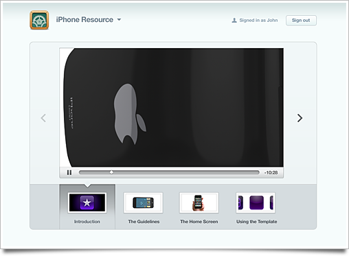
You will also get a brand new member area, where you can watch course videos, review lessons and download files. An iPhone application is also in the works, but I can’t tell much about that yet. It’ll be released a bit later than the actual upgrade.

Much design love went into this new version, and all pages have been redesigned from the ground up. The new login page went through over a hundred iterations. Click on the image to view it at full size on Flickr.

I expect to roll out the entire new Icon Resource upgrade in late February or March. As an existing member, you will be notified by email (and only this time! I hate newsletter spam) when the new content arrives. The price will remain unchanged.

19 Jan
   Filed Under: Icon Design, News   

Armin Vit posted about the now-in-beta Office 2010 on Brand New, a blog about branding. Naturally, they showed off the new(-ish) Office 2010 branding, and, unsurprisingly, the application icons of Microsoft’s latest version of Office.

office

I wanted to share a few of my observations on the new icons and the history of Microsoft Office and its icons.

Continue reading…