


I have been noticing a disturbing trend in custom interface design of third party applications for Mac OS X. As it is no longer an exception for software developers to build interface elements that are entirely unique to their application, the threshold for customizing other, system-standard interface elements is also lowered significantly. The ghastly trend I am about to describe is in existence due to this lowered threshold. In fact, I think this particular deviation off the beaten interface path would have been far more frowned upon a few years ago, when Mac interface designers were more conservative in using custom UI elements in general, and Apple disapproved of it more fiercely. Today, however, it won’t even stand in the way of scoring a design award runner-up, as my examples will go to prove.
The problem I want to address can be referred to as ‘Swiss Interface Syndrome’, and its symptoms extend to the apparently randomly distributed presence of Max Miedinger and Eduard Hoffmann’s 1957 typeface — Helvetica — in the graphical user interface. Helvetica is, without a doubt, the most used and abused typeface in existence. Since its birth, it has grown from a fad, into a ubiquitous beacon of neutrality, and today into an even more omnipresent showcase of classic Swiss typeface design. Unfortunately for us, Max Miedinger did not exactly have computer screens, Aqua source lists and pixel font sizes in mind when designing it. After all, all of those things weren’t even invented. Which is why you can probably see why using Helvetica in something like an application sidebar is such a mortal sin.

Mac OS X comes with, in my opinion, one of the best typefaces of our time that is optimized for the computer screen (also more shortly referred to as a ‘screen font’); Lucida Grande, designed by Charles Bigelow and Kris Holmes. If you are using Mac OS X, you won’t have to look far to find it; your top menu bar is completely set in it, your Dock labels are, most of your browser interface is, and even the sidebar of this website is set in it (by my own preference). It’s also obvious why Helvetica and Lucida Grande are so different; one has been designed before any computers existed, and the other was designed in 2000, with pixels in mind. Obviously, Lucida Grande isn’t as neutral or multipurpose as Helvetica; it has the clear appearance of a small-point size typeface that doesn’t work comfortably at large sizes or in print. But that is not an issue if you take into account its design principles. In those tiny text sizes of our interface, Lucida Grande truly shines. It completely gets out of your way and remains extremely legible.
Now you should be able to see why I found myself in a state of utter disarray and bewilderment when the runner-up of last year’s ‘Best Leopard Application’ Apple Design Award had an interface that proved to be more riddled with Helvetica than a keyboard is with buttons. And it set another precedent; applications like Outspring Mail, the recently released $95 mail client for Mac OS X, also joyously frolicked into the crowd of Helvetica-like interface enthusiasts by applying Arial and Helvetica liberally across source lists and list views (I thought this was Helvetica, but John Gruber pointed out it is Arial in the source list). I was at first merely outraged by the usage of Helvetica in the sidebar (I mean, three letters: ‘Why?’), which is bad enough in itself, but it’s not just limited to that; it bleeds into list views, graphs, sheets, and tables, for… well, what really? The reasons are a mystery to me.
Honestly, why? Why bother to change the sidebar and list view font?
While Helvetica fails to bother me on a high-resolution screen like the iPhone in large point sizes, the shadow of its former self known as the ‘hinted’ version, for the tiny pixel sizes it is used in in these applications, is a grim wreckage of the neutral typographic style reduced to a format it’s not comfortable in. Lucida Grande, that towers above these depressing interfaces as the window title (thank the powers they didn’t change that too) stands out like a tiger in a lineup of kittens in glass bottles.
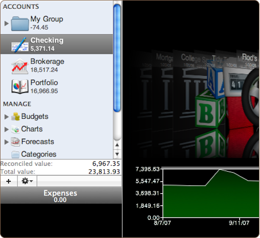
The left numerals of reconciled value and total value are set in Lucida Grande, and the jaggy numerals on the right graph are set in Helvetica. This is a screenshot of an Apple Design Award runner up, which means Apple basically approved this typographic misbehavior.
My biggest problem isn’t actually with the tasteless use of just going with Helvetica, the ‘default font’ of the last 30 years, but so intensely tearing the font out of its comfort zone of small but not minuscule pixel font sizes. Arial, Microsoft’s Helvetica clone, is also shipping on Mac OS X computers for the sole reason that its very different and optimized hinted pixel version is indispensable for correctly displaying a lot of websites. It eludes me why anyone would choose Helvetica over Lucida Grande other than the virtue that it’s different and Apple is using it.
As with most new Mac interface fads, changing a well-established interface font isn’t something that would be done by developers and interface designers without a reassuring precedent. In the last products of Apple, Helvetica has become quite poignantly present. It has expanded into Apple’s product lineup like an oil spill, from the iPhone and iPod Touch interfaces, to the new iLife suite of applications and OS X Leopard (what, you didn’t notice iPhoto, iCal, and Time Machine’s interfaces have been liberally sprinkled with Helvetica?). It is clear Miedinger’s brain child is the true comeback kid.

iPhoto ’08 using Helvetica in its main content view.
Speaking of iCal, which proudly boasts Helvetica in miniature point sizes on the screen, it has the utterly mind boggling feature that it shows you calendar information on a computer screen with everyone’s favorite 1950 typeface for print, and prints these exact calendars on paper in Lucida Grande, a computer display font from this milennium. ‘Utterly backwards’ might be an apt term for such misfit typography. With these kind of typographic failures, I truly wonder if there are still designers working at Apple with any typographic sense in their Miedinger-tainted brains at all.
Hey, look on the bright side, at least they’re not mixing Lucida Grande and Helvetica numerals too.
Apple’s receiving some flak here, and it’s for good reason; for Vista and Office, Microsoft commissioned some of the best type designers on this planet to make a set of great new typefaces. Vista now ships with a proper UI font (no more hinted Arial and Verdana like in Windows XP) similar to OS X’s Lucida Grande, and with a typeface assortment that makes OS X pale in comparison. Apple may have had the upper hand in 2002, but as the times have changed, Apple has done absolutely nothing to keep its catalogue of type fresh and to add more and better typefaces to it. This reflects in the world of design around us, seeing that 90% of computer users create things with the system-provided set of typefaces. I find it the worst example possible that a company — that is supposed to be so design-oriented — can make. Please don’t tell me I should just switch to Windows if I like proper typography, because I’d much rather get punched in the face repeatedly than being forced to switch to something else than OS X, where the ‘details’ matter.
Edited note: If you feel like further bringing this to Apple’s attention, consider sending them feedback or digging this.
I’d like to conclude this plea for common sense with the best educated guess I could find on the actual reasons for a Helvetica popularity surge in this day and age. Erik Spiekermann, a great type designer, was asked in the eponymous Helvetica movie;
“Why, 50 years later, is [Helvetica] still so popular?”
Erik stares into space a few seconds, pondering, sighs, then answers:
— “I don’t know… Why is bad taste ubiquitous?”
Good post Sebastiaan. I’ve noticed Helvetica creeping in like kudzu as well and I’m not sure why. I do know that the typeface has been on more and more people’s minds and lips recently thanks in part to the film you mention and Mac writers like Gruber who goes absolutely ape shit over Helvetica.
On the flip side, Lucida only gets me so far. It starts to feel “quaint” if you use it incorrectly and doesn’t have some of the utility feel that helvetica lends. Personally, my favorite screen font has always been Espy Sans, but using it now is like setting the time machine for 1996, so that dog won’t hunt.
Perhaps its time for a new all-purpose font that Mac users can adopt and call their own.
Thank you for saying it loud and clear!
I still don’t understand why a designer would choose Helvetica over Lucida Grande in a UI when it’s so obvious which one is better at text sizes with the screen resolutions we have nowadays. Unfortunately, this trend might expend as Helvetica is the default font on the iPhone UI…
Somebody please remind Steve Jobs what he said during its Commencement address in Standford in June ’05. Full transcript here. Watch this video at about 3’20″…
Taken from All about Steve, the most amazing Website about Steve Jobs.
Reed College at that time offered perhaps the best calligraphy instruction in the country. Throughout the campus every poster, every label on every drawer, was beautifully hand calligraphed. Because I had dropped out and didn’t have to take the normal classes, I decided to take a calligraphy class to learn how to do this. I learned about serif and san serif typefaces, about varying the amount of space between different letter combinations, about what makes great typography great. It was beautiful, historical, artistically subtle in a way that science can’t capture, and I found it fascinating.
None of this had even a hope of any practical application in my life. But ten years later, when we were designing the ï¬rst Macintosh computer, it all came back to me. And we designed it all into the Mac. It was the ï¬rst computer with beautiful typography. If I had never dropped in on that single course in college, the Mac would have never had multiple typefaces or proportionally spaced fonts. And since Windows just copied the Mac, its likely that no personal computer would have them.
Sebastiaan,
I think you’re half right. Helvetica has no place in areas like the sidebar. It’s untasteful and looks bad. Those apps you showed were perfect examples. However, I think Helvetica looks great everywhere where Apple has used it.
It’s one of those fonts you just can’t use everywhere, but in the right context is WAY more beautiful than Lucida Grande.
Lucida Grande feels really ugly at large font sizes to me.
I hear you about the new typefaces thing too. It would be nice to have new fonts included in OS X, but not really necessary.
Great post, as usual, Sebastiaan. I agree with you that it shouldn’t be used in frivolous areas like the sidebar.
Interestingly, my new website that I’m designing uses almost exclusively Helvetica Neue Light. When I first began putting the website together, it was new and not many people were using it. I’m pretty sure I designed it before iLife, Leopard and Candybar were released, amongst others. Now, I fear I may have to re-think it, because Helvetica has crept up everywhere.
Can I be the one to punch you in the face repeatedly :p
I guess that means we better remove all the Helvetica in Latitude ;-)
This was a very interesting read as I thought the Outspring Mail app was absolutely butt ugly but couldnt put my finger on why. It was the choice of font in the sidebar (amongst other things) that was to blame. I never really consider the type face when building apps (system font does it for me :p) but this has really opened my eyes to how much of a difference it can make.
Good post; I agree Helvetica shouldn’t be used like that (well, I think it shouldn’t be used as much as it is used these days to begin with). Because of the simple fact that it isn’t designed to work on screen that small. While Lucida Grande is, and looks quite nice as a typeface, I guess these developments show that Mac developers would like to have a few typefaces they can choose from. Maybe it’s time for Apple to invest in type, by commissioning some custom typefaces like Microsoft did for Vista? You already mention it in your post, and I think it’s evident that they should. :)
OH FUCK OFF!
Windows typographically better than OSX? Don’t take the piss, each one of those fonts on windows is a shoddy ripoff of an existing font that was created purely so Microsoft didn’t have to pay the creators of the original.
Apple however pays the designers of quality existing fonts.
Call yourself a fucking designer…
With the high DPI display on the iPhone, does using a “screen font” like Lucida Grande really make a difference?
I think the root cause of it all was the iPhone, where Helvetica works just fine due to the insanely high screen resolution. I suspect other folks at Apple (and elsewhere) then incorrectly assumed that Helvetica was (again) the face of the future, without realizing why Lucida Grande was still being used for the interface on desktop OS X.
Of course it could also be that they legitimately expected the resolution independence of OS X to be turned on by this point, and high-dpi screens to be available, in which case Helvetica would work just as well as it does on the iPhone. But until Apple starts releasing laptops with 150 dpi LCDs, I would appreciate developers to stick with legible faces for UI elements.
yes, egregious lack of attention to detail. next thing you know, they will start using semi-colons as if they were colons.
ahem.
They used Helvetica as the stacks’ font too, adding a blur effect to the already blurred text of those shown as a fan.
Great post. Sadly, I believe most of the blame lies with Apple and not everyone else. By ignoring the HIG and blatantly employing ‘custom UI’ elements in practically every single application beyond a certain size (and, as your examples indicate, this includes the use of Helvetica), Apple has implicitly consented to their use and fueled disregard to its own rules.
Now, regarding Helvetica’s use in applications, I believe that in terms of æsthetics, it is arguable whether it’s that bad or not as you seem to think. True, given Lucida Grande’s existence and its designation as the default font in OS X, it’s use is highly inconsistent, but the combination of higher-resolution displays and the inevitable Lucida Grande fatigue within Apple — a company with a proven record of ‘redecorating’ their UI elements with every OS X release — will probably translate to even more inconsistency in the future: the iPhone UI should, at least, be an indicator.
Didn’t know that Miedinger had a child named Brian. I guess I learn something new every day!
I expect a lot of it is that Lucida Grande has no Italic. While italics are often a blight (particularly on screen), it’s difficult to encourage its liberal usage if none exists.
A true italic is beautiful and Apple should make it happen.
Nice post. But I’ll tell you what…
I’d _never_ trust a guy who says he’s concerned about typography yet allows smilies in his site’s comments.
I wonder how often this font change to Helvetica was introduced while developers were not creating custom controls, but simply bringing the standard ones up to speed?
I’ve only done hobby Cocoa development, but I was surprised how much time was spent not working on my own code, but updating the standard controls to the current look and functionality seen in apps like iTunes & iLife.
For Pros, rolling their own controls is probably only a minor nuisance, but for a beginner it was a major stumbling point. I don’t understand why Cocoa doesn’t get more flack for this. Of course, Leopard updated a lot of stuff (like a standard window look) and I haven’t worked with that yet.
When are you flatlanders going to realize that design is much more than graphical appearance? Design in software encompasses a much broader mileau of usability and function. While graphic appearance is what everyone has to look at, it would be sad to cut into that beautiful icing and discover a cardboard box underneath. Saying Apple was wrong in awarding an app that didn’t use type the way any smart designer would is just being parochial.
I agree with everything that was said here, except the implication that the Apple Design Awards are about typography and graphics. One ubiquitous Steve Jobs paraphrase these days is that design is not how it looks, it’s how it works.
Now, typography, on a very low level, affects “how it works”. But it doesn’t affect the actual functioning of the program; it doesn’t affect any dialogue boxes or the choice of help text or the functioning of the user interface. THOSE things are what the Apple Design Awards are about.
Now I think something using a typeface that was absolutely atrociously butt-ugly and illegible wouldn’t and shouldn’t win. But something that merely feels a little off, like these Helvetica examples, are nitpicks when compared to the actual architecture of the program.
But like I said: I agree with everything else. :)
I found those comments that Jobs made pretty hilarious.
If anyone has watched this video of him demoing NeXT, they’ll know what I’m talking about. Just fast forward to see the typeface he chooses for his database application. Brilliant!
http://www.youtube.com/watch?v=j02b8Fuz73A
I don’t think the use of Helvetica is conscious.
When you use a system control like a list view you can provide it with either regular strings which are drawn with Lucida Grande, or you can use attributed strings if you want to include formatting information such as color, style, alignment, embed images in the string, or even if you just want to make it so that the string gets truncated instead of word wrapped when it doesn’t fit the cell.
The problem is that when you switch to using attributed strings the default font changes to Helvetica unless you explicitly add font info to the attributed string.
“stands out like a tiger in a lineup of kittens in glass bottles.”
Pure genius. I really hope not too many people catch the reference… however you make an extremely valid point, great article!
Sounds like you and other typeface elitists should recommend to Apple a better organization of the typefaces in the font inspector to help the lay masses know which fonts are best for print and which are best for screen.
I think you are over analyzing things. Sure at a certain size Helvetica looks like poop but so do must fonts on screen. The examples you show aren’t even all that bad and to be honest, Helvetica looks wonderful in every other instance. Helvetica is so popular for a reason. It’s a beautiful typeface.
I have no idea what you’re talking about. None of the things you apparently take for granted as ‘obvious’ are visible to me in any way. I wish you had supported your views about the appropriateness of fonts for different purposes with a little more reasoning. You aren’t the only one. There are a lot of font snobs out there, and I have never been able to get any of them to express and rationalise the design principles upon which they are basing their opinions. As far as a I can tell the situation is either (a) a secret, or (b) a bunch of people putting on airs while attempting to follow the extreme select few who know ‘WHY’ — a select few that may not even exist.
Graphic designers can explain to me their principles. So can filmmakers. Even jazz musicians. But font preferences are a mystical as the intensity of elitism with which they are expressed.
I declare ‘the emperor has no clothes’ on this article and every other ‘It’s obvious Font A Should Never Be In Spot B Just Because’ essay I’ve read recently.
Taste is just an opinion, like preferring Neopolitan ice cream — if you want it to present it as something more than that (and you do) then you need to be able to understand and clearly set forth the principles upon which you are basing this assertion — otherwise you’re just a poseur.
Helvetica might be used because the app requires italic? (Lucida Grande comes in regular and bold only; Apple’s entire website goes without the use of italic text.)
I think the trouble here is design-clueless developers knowing just enough about type to shoot themselves in the foot. Not (as some seem to think you’re saying) that Helvetica is a bad typeface. Type is like color — blue isn’t “better” than red, but in context, one can look awful compared to the other. Competent designers know this. Trend-whores don’t. For example, contrast Panic’s CandyBar 3, which uses Helvetica Neue to great effect, with Outspring Mail’s nonsensical swap. Likewise, Panic comissioned a custom monospace code typeface with Coda.
Also, I’d quibble on the point about Vista having a better type selection than Mac OS X — that’s only true if Office is installed. Most of the staple faces that come with Mac OS, like Gill Sans, Baskerville, etc. aren’t available on Windows except as part of an Office install.
So true. But why serif fonts for this website (screen)??? ;-)
Might I put forth a possible reason Helvetica is used in the sidebar? It’s thinner than Lucida Grande, so you can display more text in the available area. Since sidebars are usually slim, it makes a lot of sense.
Not saying it’s a good reason, but there it is.
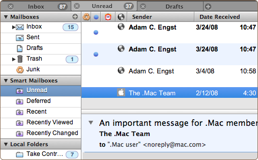
one thing i noticed is that apple also uses helvetica in Mail.app’s sidebar for the numbers of unread messages… i think for such single numbers helvetica looks much better than lucida grande. As for normal text, Lucida Grande renders much better to the screen than helvetica.
Karsten
It’s minuscule, not miniscule.
Historical note: The NeXT user interface used Helvetica throughout. Perhaps this isn’t so much a new fad as an old usage reasserting itself.
Interesting to read all the comments, especially the “elitist” ones where they clearly havnt read much of your stuff ;-)
Here is how I really found the evidence in your post: That Outspring mail app screenshot. To me it looks but ugly, but I couldnt put my finger on why. The tabs look ok, so do the seperators, theres a decent use of gradients in the headers. But its the Helvetica in the sidebar. Its just too thin.
I agree with Allan Odgaard on this. The problem is most likely caused by the fact that Helvetica is what you get by default if you don’t specify a font.
Well, a combination of that and some dumb Windows programmers who still haven’t realised that Helvetica and Arial are not the standard UI font on OS X, and/or through some unforgivable failure of good taste have decided that they prefer Arial for UI elements.
Helvetica *does* look quite nice sometimes though (iPhoto’s main view is one example), and it’s true that Lucida Grande, like other fonts designed primarily for display, starts to look a little odd at larger sizes sometimes. It’s also nice in some cases to reserve Lucida Grande for things that are actually UI elements and use Helvetica for text that is logically part of the document; doing so helps to make clear which things “belong” to the user and which don’t.
As for that Outspring mail client, it looks *awful*, and all because of careless use of the wrong font. $95 seems far too much money to charge for it too, but that’s another matter.
Looking at the screenshot of Outspring, I think its ugliness is due more to poor use of whitespace and the bad icon choice than the use of Helvetica.
I worked on Finder (and TimeMachine) over numerous releases of OSX. In the early OSX releases, a single designer has significant influence over the choice of fonts, colors and background patterns. As the number of shipping applications increased, several designers make design decisions and some of the earlier design choices became diluted and modified as the original designer moved to other projects. Interfaces like TimeMachine would never have been considered in the Cheetah time frame because it would have been such a radical diversion from the original interaction philosophy.
The only design influence left over from the Next era would be Steve. Some of the UI designers barely remember NextStep and certainly never worked there.
The Outspring mail client suffers not only from confusing typography, but from basic design issues. The icons and labels in the sidebar are not horizontally justified and the selection highlight accentuates this. The same issue is present in message list. The unread column icon is vertically centered in th column but the rest of the columns are not. This creates visual noise that the choice of font amplifies.
A lot of the people commenting here seem to miss the point. It is not the typeface itself that Sebastiaan dislikes, it is the use of it in this context. Helvetica is not designed to work well in small sizes on screen, since it is not hinted for it. So it is purely a technical issue, not aesthetics. Yes, it looks ok on the iPhone screen, because its dpi is high, and it can also look quite good on screen if you use it in large sizes.
When you apply it, however, on such a sidebar it just does not work; the hinting is not precise enough. Google ‘hinting’ if you do not know what it means.
@ Lanny Heidbreder:
“design is not how it looks, it’s how it works.”
& instig8r:
When are you flatlanders going to realize that design is much more than graphical appearance?
Good typography has everything to do with how (well) something works. It’s called readability and legibility. A vital part of design, I would say.
@ James:
“Don’t take the piss, each one of those fonts on windows is a shoddy ripoff of an existing font that was created purely so Microsoft didn’t have to pay the creators of the original.”
You really need to educate yourself before you comment. If you had, you wouldn’t have posted such an ignorant and uneducated comment. Would you care to elaborate on what typefaces are being ripped off by the ones that come with MS Office?
I must agree with the assertion that Microsoft has thrown in some nice fonts with MS Office 2007. I’ve really enjoyed Calibri (now the default) and several of the others (Candara, Constantia.)
Someone mentioned Windows people getting confused with the Arial/Helvetica problem.
Before I got real Helvetica fonts on my Windows machine, I noticed a font called “Helvetica” that basically mapped itself to Arial. I hadn’t noticed it before so maybe it appeared when I installed Office 2007. Either way, this Arial being called Helvetica font is still on my computer and I’m sure it’s causing all sorts of confusion for people. (Screenshot here showing this placemarker font and the clearly Arial “t” that’s created even though it’s called Helvetica.)
I declare ‘the emperor has no clothes’ on this article and every other ‘It’s obvious Font A Should Never Be In Spot B Just Because’ essay I’ve read recently.
Taste is just an opinion, like preferring Neopolitan ice cream — if you want it to present it as something more than that (and you do) then you need to be able to understand and clearly set forth the principles upon which you are basing this assertion — otherwise you’re just a poseur.
I think you need to talk to some new graphic designers.
While taste is certainly a consideration in choosing a typeface for a given, it is a minor one. A much more important consideration is usually: what typefaces fit this use? Any typeface, including what is probably the most hated one of all–Comic Sans–are all designed for a specific set of appropriate uses. This article is about technical details, specifically the appropriateness of setting Helvetica so small on screen. Don’t assume something is intangible just because you don’t understand it yet.
edit: While taste is certainly a consideration in choosing a typeface for a given job…
Being largely ignorant in font issues, what are the good resources for font usage? Which fonts are well hinted so they look good at small sizes. Usage of Serif versus Sans Serif for screen display versus printing hard copy.
I realize the full story may be huge, but limiting to system provided fonts would cut it down some.
I believe the root of this problem lies with NSAttributedString using Helvetica as it’s default font. (see end of overview at http://tinyurl.com/4adj6c )
It appears that many programmers either don’t notice or don’t care when Helvetica shows up in their UI as a result.
Your point would be better made if you gave positive examples along with the bad. To be honest, I don’t really get what you’re saying in this article/rant.
Should Apple be more strict on third-party applications? Should they review every application that comes out to be sure they follow the guidelines? Should they not award applications with poor font choices, when they might have other application design merits? Should developers be more educated in graphic design? Should graphic designers learn more about computer graphics?
You end with the conclusion that this is just about “bad taste”. That’s a bit of a cop-out, don’t you think?
Why Helvetica? It´s simple: because it is so much narrower than this – at sizes beyond 14 pts – fat and clumsy looking Lucida Grande. Sidebars should not take too much space, therefore are in need for a narrow font.
What´s right for the menu bar isn´t appropriate for longer lines of text. It´s true that Helvetica even hinted does not look great at sizes lower than 13 pts, but Arial really does – at least at 11 pts even on a 72 dpi screen. I do not want to promote Microsoft fonts, but Arial works for small text better than Lucida. … But … what I really miss is the elegance of the System 6 and early System 7 Interface. Remember Chicago? It was so great for unsmoothed text as long as you stick to 12 pts. And Geneva was so economical in 9 pt on 9 inch screens.
Peace! Theo
Great article, but do you think using a serif font for large areas of copy on screen is really a good idea?
Apple: I’ve spoken at a couple of events where I point out that Apple has a schizophrenic type brand. But that wasn’t always the case. The terribly ugly ITC Garamond Condensed used to be one of the most recognizable aspects of their brand. Now Arial, Myriad and Lucida appear in their products causing an awful clashing of type styles. Arial is from a different genre of sans serifs than Lucida and Myriad and is the equivalent of wearing pants with horizontal stripes with a shirt with vertical stripes.
Helvetica: Not a good type for screen. The figures are too similar to each other causing potential legibility problems. The very closed counters on a, e, g, s cause these letters to fill in with blocky pixels. The weird proportions always bothered me – why would a cap M be narrower than the E!? Using Helvetica in the iPhone could be viewed from 2 angles… 1) The slim, sleek lines of the iPhone require a typeface bereft of ornamentation and utterly timeless (Helvetica Good). 2) The iPhone is a personal gadget requiring an approachable, legible typeface (Helvetica Bad).
To me, The crazy thing is that Apple invested so much in Lucida’s large linguistic offering for the Mac. If nothing else this would be reason to make it the UI font for iPhone.
-steve
I like how you talk about all this like it’s fact. The interfaces you showed at the top both look like shit and that has nothing to do with the typeface. Helvetica looks much better than Lucida Grande, period.
sebastian de with
happy new year for you
29 april your birth day
creative year for you and for us
interresting fonts you using for your blog ;)