


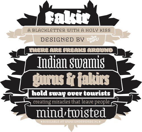
For this small weekly, I wanted to put the spotlight on the heroes of this year in typography; the Annual Type Director’s Club selection, including one of my favorite, part-Dutch foundries; Underware. These very good designers bring out innovative and very pleasing typefaces in a steady pace, and their last superfamily lives up to their reputation. I think it deserves winning the TDC ’07 more than any other (apart from perhaps Beorcana).
Apart from the brilliant runic Beorcana, the ‘Subtil’ typeface was an eye-catcher. Beautiful design and stylistic sample text made this a specimen my eyes lingered on for quite some time.
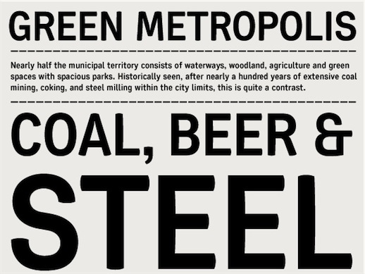
Doesn’t that feel big city-esque to you? It really reminds me of those Californian vista’s you often see on stock photo’s, with big highways set through a scene of high-rise buildings and a city park, the green of the leaves and grass in the park intermixed with a blending shade of dull grey in the air that is painted in the sky by the smog of the many thousands living and moving there. I think this font and it’s sample text captured exactly that for me.
I suggest you check out the winners of TDC ’07 yourself. You won’t be disappointed.
Underware’s Fakir is indeed a very much deserved winner of TDC. And I like the typeface ‘Olga’, from the Text/Type Family category, as well.
The calligraphic broad-nib pen influence is just fantastic. :)