


Apple has announced the release of Leopard, the newest incarnation of Mac OS X. Amongst 300+ new features, it also boasts several graphic enhancements like resolution independence, 512 pixel icons, a reflective dock and new a unified ‘theme’ for application windows. Now, only days before the release, I want to show you some of the major improvements and additions to the Mac software aesthetic.
source lists
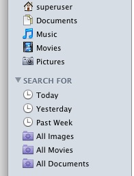
In Leopard, all Apple applications that have a list in the sidebar (known to developers as ‘source lists’), use the iTunes-style light blue look. We’ve seen this on Tiger as well, with iLife ’08. Personally, I think it’s an improvement in most areas; the use of this style in the Finder sidebar is perhaps a bit questionable; the icons are all at minimal (16) pixel size, reducing their hit- and drop-area. There is no option to revert to large list items.
window controls
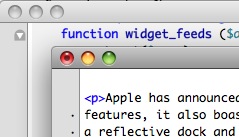
Even the familiar ‘traffic light’ window controls of OS X have gotten some polishing. The going term for the new look is ‘gemstone’, which about sums it up; a less flat, more contrast- and color-rich goblet adorns our windows now. You may find it better or worse, but it is very obvious that these window controls are made to nullify the grimness of the dark metal unified windows.
window theme
Grim, regal, stylish. The unified look of Leopard has had a lot of praise and critique; for Tiger, the customisation package ‘UNO’ addressed the complaints of users confused by the many window appearances in Tiger, and Apple must have taken a hint; Leopard features a single style for all windows. There isn’t much to say apart from the ‘gemstone’ window controls; everything just looks sleek.
reflective dock
One of the new ‘features’ presented at WWDC 2008 was received with far more critique and cries of outrage than any other; the reflective dock of OS X 10.5. Criticized by UI professionals and developers alike as being in violation of the very HIG (Human Interface Guidelines) that Apple compiled, or being a waste of CPU cycles, or looking bad in any other position than the bottom, and having superfluous visual effects that actually diminished the clarity of the Dock’s interface, it seemed like nobody truly liked the new Dock. The dust started to settle with subsequent developer builds of Leopard and people getting accustomed to the new look.
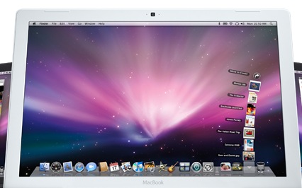
Honestly, I didn’t feel a lot for the new Dock when I saw it, but after a few weeks of use, noticed it was truly a lot more pleasurable when you have a lot of items in it. The model of a shelf helps group such visually diverse objects and dismiss the notion that the icons are on the same ‘plane’ as the windows. For me, my eyes rarely ever touch the Dock anymore, and the blue dots work very nicely in my peripheral vision to see what is open without actually losing focus of the task at hand. A worthwhile addition to the UI, if you ask me.
icons, icons, icons…
Most important for me, being an icon designer, the new icons make all the difference. Bigger, smoother, all around improved. Large aspects of the icon redesign were tools like Network Utility. Some tiny details; Front Row, the media system you can activate with your remote, has gotten a nice theater-seat icon, System Preferences has gotten a gorgeous new iPhone-stye icon, iChat’s has gotten minor shading tweaks. The Finder sidebar, which was quite an unclean affair in Tiger, now looks very clean and modern with the new icons for Music, Movies, Pictures and Documents (see Source List).

Also, with Coverflow in the Finder, specific new folder icons were made with a front-on perspective; it’s obvious why they made the choice for this, just look at your home folder;
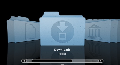
The new folders have a head-on perspective, because these can be transformed in Coverflow without everything looking rather odd. It’s too bad that some of these considerations weren’t made for the new dock, where some icons do look a bit spatially disoriented (or perhaps conflicting).
All in all, if you look just at the icons, desktop, and windows of Leopard, it’s worth switching from Tiger. It is very clear that Apple’s design team focused on bringing the great parts of the UI further together and finding a great unified theme to make the bright photorealistic design of icons and UI widgets stand out even more. Designers and the visually inclined will feel right at home with this grand step forward in aesthetics.
Thanks for the great article Sebastiaan, keep ’em comin!
Bren
Very spiffy article, now I’m even more excited for Leopard.
What’s that program in the screen shot under “window controls”? Looks very, very interesting.
Keep up the awesome blog, it’s a pleasure to read. (Love the new design, too.)
There appears to be something up with your Digg counter, though… Shows up with “” below it.