


You know, I actually made my first real own lolcat. It’s at the end of this post.
I study at an Art Academy, here in the Netherlands. I am sure that gives you a very glamorous idea of how things would look, stylish and thoughtful design and all – but I have to disappoint you. Take a look at this.
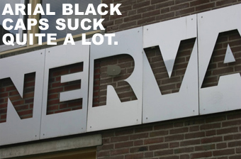
First of all, it’s not just Arial Black we are using here. This facade actually cut plates of metal with a laser, for a lot of money, and out of a major list of typefaces, went to great lengths to pick… Arial Black? And what’s up with the CAPITALS? It’s absolutely horrid and disgraceful for any Art Academy. Because I hate it so much, I made a list of reasons why I hate it;
And, the most important reason of all…
Also, notice the beautiful dislocated inner negative space of the ‘R’. I have found many to agree with my opinion that this should be torn off the building overnight. I happily quote the most influential figure amongst them;
They could have also used Comic Sans… ;)
If that would have been the case, I would have to get it down. Maybe even burn it.
I am sure it was made by the lowest bidder!
Ugh so ugly. I am ashamed. And that on a building owned by a school which once taught Wim Crouwel.