


No, I didn’t feel like an April’s fool joke. It’s one of the reasons why I didn’t re-skin the blog on this day. Anyway, I couldn’t possibly trump the Google jokes. Brilliant stuff. This post will just be a blurb of some off-topic stuff and a bit of thoughts on icon design. I hope to be a bit more faithful in my monthlies, as the last wednesday and two fridays had to go without real graphics or typography.
On a side note; why the hell doesn’t Aperture start up if you have Bonjour disabled? It starts peppering you with all sorts of vague, opaque error messages if mDNSResponder isn’t running.
When I design icons for an application, I always heed critique from ‘ignorant’ users, fellow graphic designers, and developers. It’s important that icons are identifying, aesthetically pleasing, discerning, and comply to guidelines (and having read and hopefully grokked the Apple HIG, I think this is good, but anyone has the right and ‘duty’ to show me any erroneous design decisions made).
Conceptual design is always the first phase. I don’t just sketch in this phase, I think, and, Wil Shipley style, I think, and I think some more. Then, I rethink the whole thing. After that, I start sketching and thinking in parallel. After that, I start thinking and designing mockups on my Mac in parallel.
Mostly, I get incidental productions in Photoshop (or GIMP) and Illustrator (or Inkscape) and some design guidelines through my sketches. I start refining designs I like, and pick a final version. I often design other icons for the application in question along with the main icon, because there is often some sort of coherence or association going on. Finding inspiration in icons you like is good as well, because it’s always useful if your icon turns to be similar – you can get to work discerning your icon.
For example, after this phase in the design of the Praetorian app, this icon came out. It’s not compliant to the Tango icon guidelines, as it lacks a distinct silhouette, but this, I found less than important for the time being.
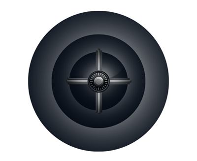
In this stage, the application wasn’t even called ‘Praetorian’, it had an absolutely stupid name I won’t tell anyway. What isn’t entirely clear in this image, is that it has transparency, all of the grey in the sphere apart from the center. That really didn’t work – on a black background, it was completely black.
I decided to fix that, give it a bit more contrast (for depth) and make a document icon out of it.
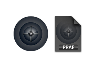
Now, by this time, you can see there are already color theme issues in the document icon and the application icon. Color themes allow us to associate application icons even more easily and intuitively. I also got some feedback from people; some things that lack (which I saw too), was that there wasn’t a ‘realistic’ outline (dark / light, with shadow) of the application icon, the icon lacked texture, and color. What isn’t obvious here, is that the application icon also used the full 128 pixels, which made it too big in the dock. Aperture’s icon (also round) is actually smaller than that, leaving some ‘air’ for the icon, which is good.

As you can see, the amount of depth and the texture of the icon changes dramatically. The icons are now visually related, and convey much more atmosphere with more color. The result? A nice dock icon, and a fine document icon to work with.
I’ve decided not to continue with buying a new drumkit. As soon as I have an iMac i’d love to beta this ;)
You’ll even be able to beta this at school – how cool is that? ;)